The Atlas for the End of the World is a collection of maps and infographics covering two important subjects: the first is the amount of protected area in the world’s biodiversity hotspots and how these regions are tracking in regard to meeting 2020 United Nations (Aichi) protected area targets; the second is an assessment of which cities in these hotspots are growing on collision courses with remnant habitat and endangered species.
Nice idea, of course. And given their first aim, as described above, they didn’t really need to do anything on genebanks or botanic gardens. But they did, and here is the resulting map (click to enlarge).
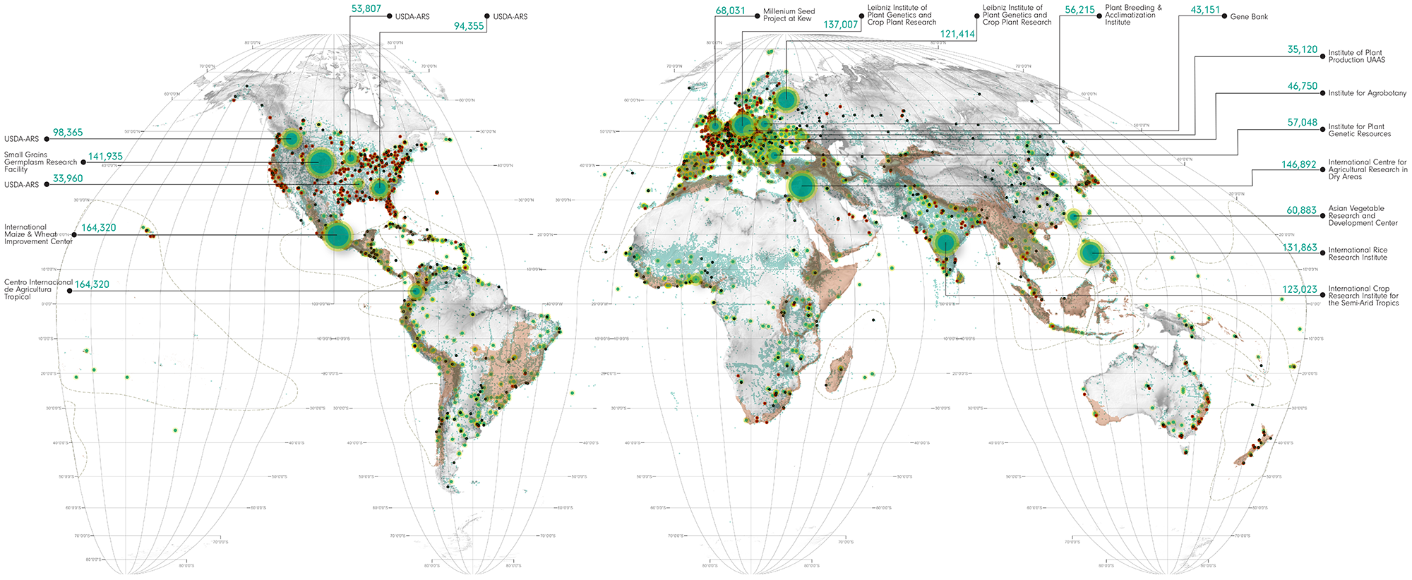
And this is what they say about it:
Even at a glance this map shows the disturbing fact that while the hotspots are being drained of life, small zoological and botanical gardens seem to be flourishing.
Well, I don’t think you can see that, at a glance or otherwise. Plus the choice of genebanks to display is eccentric. And the Vavilov Institute is mislabelled.
Here’s the WIEWS map of genebanks with more than 10,000 accessions.
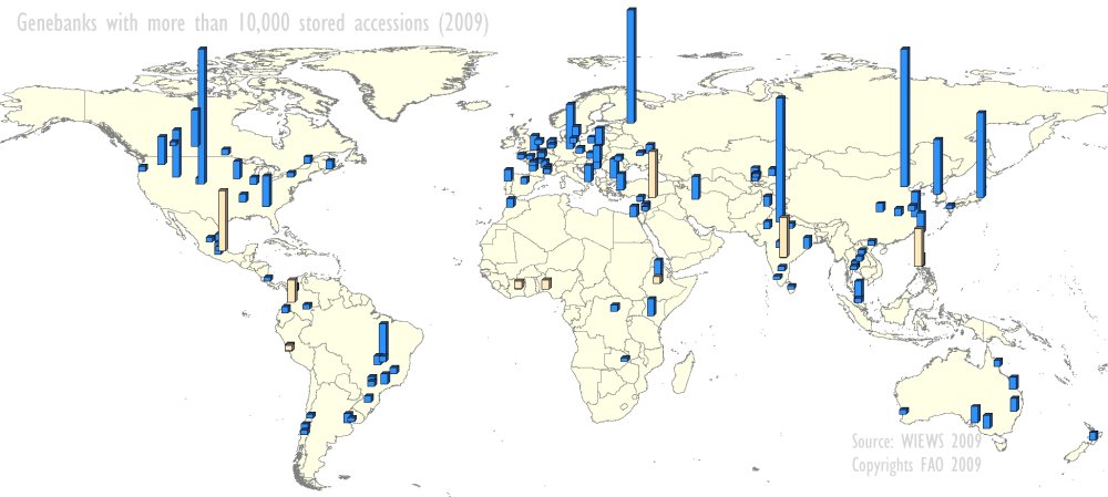
Can you tell, at a glance, which ones are flourishing?
Something wrong with the first map – it has CIMMYT and CIAT with exactly the same number of samples. And what about Svalbard?
And what exactly is ‘flourishing’ meant to convey? Some large genebanks are in dire straits. I’ve seen enough of genebanks over the past year to understand something of their health and state of their collections.
Should Ft. Collins be listed, given that it serves as the USDA base collection and is not available for distribution?