David Benscoter spent 24 years mastering his skills as an investigator, breaking cases on bank robberies and political corruption for the F.B.I. and the I.R.S. Now, he’s taking a bite out of a different kind of problem — lost apples. Apples have long been a hot commodity for the people of Washington, but in recent years, many orchards have been left abandoned. As orchards are neglected, many varieties of apples are being lost to culinary culture. Benscoter is bringing them back. So far, the apple investigator has given new life to three lost varieties: the Nero, the Arkansas Beauty and the Dickinson.
Brainfood: Banana diversity, Cacao and CC, Coffee and CC, Zosya diversity, Certification, Genetic surrogates, Potato diversity, Food sovereignty, Swiss wheat, Seed storage, Golden potato
- Diversity and morphological characterization of Musa spp. in North Kivu and Ituri provinces, Eastern Democratic Republic of Congo. New cultivars still being discovered.
- A review of research on the effects of drought and temperature stress and increased CO2 on Theobroma cacao L., and the role of genetic diversity to address climate change. We have the diversity. But for how long?
- Climate change adaptation of coffee production in space and time. Gonna need Plans B and C. But do we have the diversity?
- Evaluation and Breeding of Zoysiagrass Using Japan’s Natural Genetic Resources. Stick to morphology.
- Where are commodity crops certified, and what does it mean for conservation and poverty alleviation? Less for poverty alleviation than for conservation. But more and better spatial data needed, especially on organic certification.
- Environmental and geographic variables are effective surrogates for genetic variation in conservation planning. Phew!
- Genome diversity of tuber-bearing Solanum uncovers complex evolutionary history and targets of domestication in the cultivated potato. More diversity in the landraces compared to wild species than in any other crop, few genes involved in early improvement, and different loci for adaptation to uplands and lowlands; also, wild relatives involved in diversification of long-day types.
- Agricultural biodiversity is sustained in the framework of food sovereignty. Peasants feed the world.
- Crop domestication facilitated rapid geographical expansion of a specialist pollinator, the squash bee Peponapis pruinosa. Bee follows crop follows people.
- Unlocking the diversity of genebanks: whole-genome marker analysis of Swiss bread wheat and spelt. Early breeders missed some stuff.
- A probabilistic model for tropical tree seed desiccation tolerance and storage classification. Predict storage behaviour from morphology.
- Potential of golden potatoes to improve vitamin A and vitamin E status in developing countries. Here we go again.
Seeds in motion
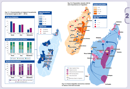
I guess it’s an occupational hazard, but whenever I see such maps, as in the new atlas Rural Africa in motion. Dynamics and drivers of migration south of the Sahara from FAO, my first question is: how many of those people are carrying seeds?
A modicum of Indian rice diversity
https://twitter.com/RiceResearch/status/930374790480723968
Always good to see a politician visiting a genebank.
And that 18,161 should be 18,163 now I guess.
Brainfood: Landrace adaptation, Scarascia Mugnozza, Scuba rice, Pineapple pollen, Wild French carrots, Saudi chickens, Fava diversity, Banana ripening, Wild wheat, Bavarian vetch
- Towards the Genomic Basis of Local Adaptation in Landraces. Genomic scans for adaptation will solve everything.
- International Instruments for Conservation and Sustainable Use of Plant Genetic Resources for Food and Agriculture: An Historical Appraisal. The Italian connection.
- Genetic potentiality of indigenous rice genotypes from Eastern India with reference to submergence tolerance and deepwater traits. There’s much polymorphism at Sub1 linked microsatellite loci.
- Cryopreservation of pollen of wild pineapple accessions. Complementarity rules!
- Genetic diversity and taxonomic aspects of wild carrot in France. Someone’s a splitter.
- Characterisation of Saudi native chicken breeds: a case study of morphological and productive traits. All like it hot.
- SSR analysis of genetic diversity and structure of the germplasm of faba bean (Vicia faba L.). Separate Middle Eastern and N+E African groups. Pass the chianti.
- Natural variation in banana varieties highlights the role of melatonin in postharvest ripening and quality. So does that mean that you could market some varieties as a jetlag cure?
- Genetic Characterization of Genetic Resources of Aegilops tauschii, Wheat D Genome Donor, Newly Collected in North Caucasia. Confirmation of two genepools within the species.
- Do seed transfer zones for ecological restoration reflect the spatial genetic variation of the common grassland species Lathyrus pratensis? Not in Bavaria.