Mapping the 1970 corn blight

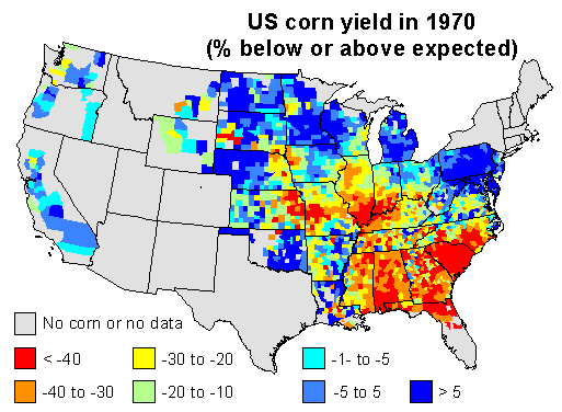
Here are my 2 maps 1 for this discussion. I used linear regression to predict corn yield for each county in the US, using time (year) as the independent variable. I used the years 1950 to 1969 to create the model, and to predict corn yield in 1970. This should be a reasonable estimate of the ‘expected yield’ for 1970 for each county, if it had been a ‘normal year’.

I then computed the difference between the expected yield and the yield obtained by farmers, and expressed that as the percentage of the expected yield. Negative numbers mean that yields were lower than expected in a county, positive numbers mean that they were higher than expected. Counties with data for less than 9 years were excluded.

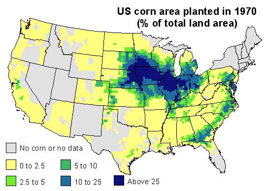
1970 corn yields were indeed much lower than expected in the southeast. Corn blight hit very hard. But also note that yield was stable or up in the north and in the west, and look were US corn was grown in 1970. The map below expresses corn area as the percentage of the total area of a county.

Most corn is grown in the corn-belt. The southern parts of it were much affected by the disease (The Illinois Secretary of Agriculture’s estimate that, by August, 25 percent of his state’s corn crop had been lost to the blight may have been spot on). But 1970 was a normal or good year for corn yield in the northern and western parts of the corn belt, and that compensated for the losses incurred elsewhere. If you sum it all up, corn production was about 15% lower than what could have been expected. That is whole lot of corn — but perhaps not that exceptional as far as bad years go.

Here is a table of estimated corn yield by state, as percentage of the expected yield for 1970, and the corn area, as percentage of the national area (only for states with more than 1% of the national corn area in the counties data set).

State Yield Area   State Yield Area
Florida -36 1   Minnesota -12 8
Georgia -33 3   Missouri -11 5
Illinois -31 18   Nebraska -9 9
Indiana -27 9   North Carolina -5 2
Iowa -26 18   Ohio -1 5
Kansas -24 2   Pennsylvania 0 2
Kentucky -22 2   South Dakota 6 4
Michigan -12 3   Wisconsin 15 3

US government blames maize yield losses on Southern Corn Leaf Blight

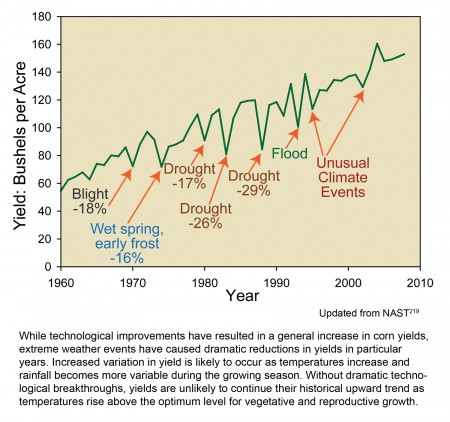
Our friend Jacob’s Google-fu is stronger than mine. He found this annotated graph of maize yields in the US.

See how they’ve claimed that blight reduced yields by 18% in 1970? That would be the Southern Corn Leaf Blight that wasn’t a problem, and the yield loss wasn’t caused by lack of genetic diversity.

Well, of course, the government would say that, wouldn’t they, after shelling out all that money on plant breeding and stuff …

Featured: Southern Leaf Blight

Robert takes a certain delight in adding his voice to the chorus questioning the Southern Leaf Blight metanarrative:

Isn’t it remarkable that this is the only (well-known?) incident of this nature in recent history? And that it only was an incident that cannot even be detected on the yield charts? Are the levels of diversity that we are maintaining in the fields perhaps sufficient?

What’s next for the chopping block? Potato blight and the Irish famine?

Blight is right: genetic uniformity was to blame

The Southern Corn Leaf Blight epidemic that struck the US in 1970 is usually seen as a canonical example of the dangers of genetic uniformity. I use it that way myself, often. Certainly yield losses in 1970 seemed very high, higher than the average 12% “expected from all diseases of corn”. But could we all be wrong? A commenter thinks so.

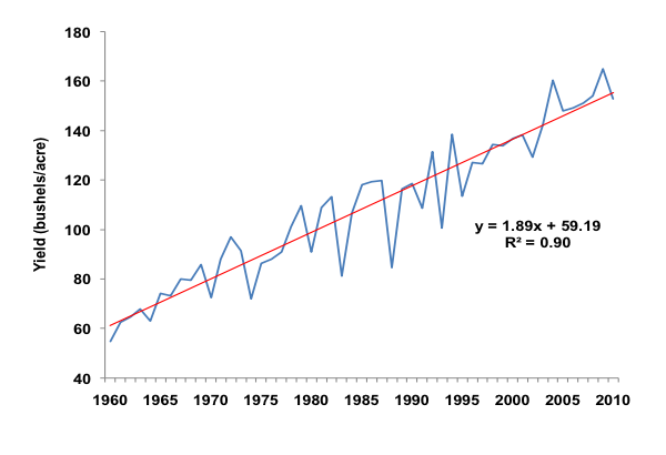
[W]as it a major problem? Over twenty years ago I gave a seminar at CIMMYT. I had prepared a slide showing the year on year average yield increase 2 in maize in the USA for about 70 years‚ but leaving off the actual years. … I challenged the audience to identify the blight year (1970). Nobody could. … Try this on colleagues and students.

I did, and it is true, 1970 does not look all that extraordinary against the trend.

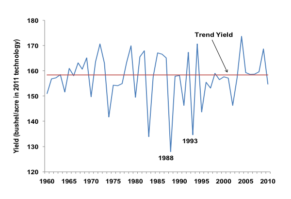
A more interesting graph is this one, in which the rising trend in average yield is removed from the actual yield each year.

Now 1970 is a little more visible, though I agree it still doesn’t look catastrophic. I mean, compare that with 1988 and 1993. There is one huge difference. In 1988 drought was widespread, while in 1993 floods devastated many farms and yields in the northwest corn belt. Weather in 1970 was just fine, thank you. Weather is clearly a very important factor in annual yields, and it interacts with pests and diseases in complex ways, but it seems pretty clear that the yield loss of 1970, while not as drastic as in other years, was certainly not the result of wayward weather.

The commenter asked “are we making too much of a fuss about the Leaf Blight”? I don’t think so, obviously, so I asked Professor Darrel Good, of the University of Illinois. He knows more about maize yields than almost anyone (and is responsible for the graphs above). He said:

I have not seen any specific analysis of 1970, but am pretty sure that the decline in corn yield was in fact attributed to the outbreak of southern corn leaf blight. Hard to quantify that impact relative to weather. It is a similar phenomenon as the aphid damage to the soybean crop of 2003. 3 These rare events are not captured in our models.

In some respects, pests and diseases are as unpredictable as weather. In industrialized agriculture, genetic diversity within a crop is unlikely to provide much protection against the vagaries of weather. 4 But genetic diversity definitely can protect against unpredictable pests and diseases, not just in maize, and not just against Southern Corn Blight.

Calling all botany bloggers

This month’s Berry Go Round will be hosted by the illustrious founder of the internet’s best (and perhaps only) botanical carnival over at Seeds Aside. For some fun and inspiration, have a look at some of the other Berry Go Rounds hosted at Seeds Aside. You have until April 26th to get your plant-loving posts submitted. And if you would like to host this marvelous opportunity to share the botanical love, there’s a link for that too.