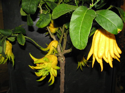
They do have a knack for marketing agrobiodiversity in Texas. Thanks, Kem.

Crops, livestock, microbes, pollinators, wild relatives, agroecosystems, foodways …
They do have a knack for marketing agrobiodiversity in Texas. Thanks, Kem.
 This barely merits the Research Blogging tag, because all I want to do here is raise a possibility, and a tenuous one at that. I confess that I was attracted in a high-speed scan of headlines, by this one: Leaving home ain’t easy: non-local seed dispersal is only evolutionarily stable in highly unpredictable environments. 1 The starting point is the common armchair argument that seeds disperse for three non-exclusive reasons: to escape changes in the environment they are leaving, to avoid overcrowding (and competition with sibs?) and to find and exploit new environments before other competitors.
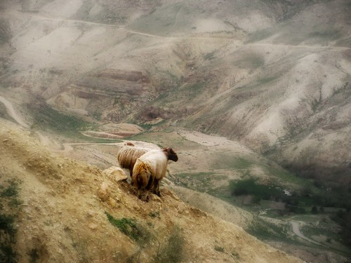
Robin Snyder’s mathematical model seeks to understand how far seeds need to move from their parent to be reasonably certain of encountering different growing conditions. After all, “why ‘escape in space’ only to land somewhere more or less like where they started?” The models show that in almost all cases, dispersal tends to be not far enough to get away from the “parental” conditions. Only when favourable conditions are very fleeting is it worthwhile for some seeds to leave home far behind, as a “response to environmental unpredictability”.
Why bring this up here? Because the seeds of high-performing agricultural varieties are often dispersed hundreds or thousands of kilometres from the environments in which they were deemed successful. In theory they are being sent to places with very similar growing environments. But might this actually be an argument for sending seeds far from home specifically as a strategy to enable the farmers selecting them to respond to environmental unpredictability?
It’s been a busy week or two for food and agricultural policy news, what with the Arab world supposedly ignited by high food prices and weighty documents elsewhere calling forth high-minded rhetoric and tosh in roughly equal measure. To be honest it doesn’t feel right to do more than offer our endless refrain: that there is no one-size-fits-all solution out there, and that diversity brings resilience at levels from the individual meal to the global food network. And to point to some thought-provoking items. To whit:
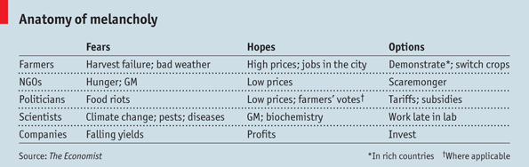
The Economist’s deeply cynical story How much do rich governments really worry about feeding the world? seems to hit all the right spots.
The UN’s Special Rapporteur on the right to food seems to hit all the spots you might have expected him to hit, buttering parsnips like nobody’s business.
And the European Union has, as usual come up with a very snappy acronym for a million euro project to tackle malnutrition in Africa: SUNRAY, short for Sustainable Nutrition Research for Africa in the Years to come. Here’s what they’ll be doing.
- WP1 optimises communication and coordination within the Consortium.
- WP2 maps current nutrition research activities in sub-Saharan Africa, and examines the operating environment.
- WP3 analyses the views of stakeholders.
- WP4 examines the impact of environmental changes on nutrition.
- WP5 builds consensus on research priorities through workshops in three African regions.
- WP6 develops a strategic framework for future research in the form of a roadmap.
- WP7 disseminates project outputs.
I don’t know about you, but I’m surprised when, on the same day mind you, the Costa Rica News has a piece about a new citrus genebank at CATIE and Balkans.com an article about the genetic relationship between Turkish and Hungarian apricot cultivars. Pleasantly surprised.