Let me expand a little on yesterdays’s teaser about the Seedlot Selection Tool.
Say you have an accession of maize, for example, collected 20 years ago, for example, somewhere in the middle the NW zone of Mexico defined by Orozco-Ramírez, Perales & Hijmans (2017), for example.
Say that you’d like to know where you could grow that material 20 years from now.
Say you have a few minutes to learn how to use the USDA’s Seedlot Selection Tool.
This is what you would get, more or less, depending on the details.
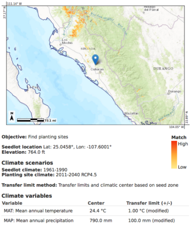
The blue dot is your collecting site, the red bits are the places where that material will be adapted in 2040. And you can run the thing the other way around too. That is, given that you want to grow something in 2040 where that blue dot is now, where would you have to have collected it in the past?
The Seedlot Selection Tool seems to be aimed primarily at forest and landscape managers, but I see no reason why it couldn’t be used in agricultural applications too, as above, subject to the same provisos.
The Seedlot Selection Tool (SST) is a web-based mapping application designed to help natural resource managers match seedlots with planting sites based on climatic information. The SST can be used to map current climates or future climates based on selected climate change scenarios. It is tailored for matching seedlots and planting sites, but can be used by anyone interested in mapping climates defined by temperature and water availability. The SST is most valuable as a planning and educational tool because of the uncertainty associated with climate interpolation models and climate change projections. The SST allows the user to control many input parameters, and can be customized for the management practices, climate change assumptions, and risk tolerance of the user.
Would love to get my hands on a global version.