- Saving citrus by freezing it.
- WorldVeg pushing tomatoes in the Solomons. New York next? Ah, but what they really need is Mind Gardens. Oh, and a how-to-save-seeds book. Or maybe just Jeremy’s latest podcast on breeding your own veggies.
- Ecosystems get their red list too.
- “Although there are some who consider Brazilian agriculture to be aggressive and destructive, we want to share another vision for the rest of the tropical belt…”
- But if it’s too late, of course you can try to restore them.
- Video of wheat regeneration in Canada. Like watching grass grow. No, wait.
- The naming of plants, music to our ears.
- Kew does Lathyrus sativus, grass pea to the rest of you, music to Luigi’s ears.
- IFPRI is going great nutritional guns, with the low-down on tef and biofortified millet.
- So, Big Picture Agriculture’s hop garden is flourishing.
- Likewise rabbits in Kenya.
- Enough already with the quinoa.
Brainfood: Touristic islands, Pearl millet diversity, Barley diversity, Maize diversity, Weird chickpea, Sweet potato diversity, Pawpaw diversity, Grewia domestication, Agrobiodiversity is the key, Sunflower relative dynamics
Sorry about the Brainfood hiatus lately. Back now, and with a vengeance.
- Plant genetic resources in a touristic island: the case of Lefkada (Ionian Islands, Greece). Landraces and tourism can coexist.
- Assessment of genetic diversity among pearl millet [Pennisetum glaucum (L.) R Br.] cultivars using SSR markers. The cultivars coming out of a given breeding programme cluster together. No!
- Population genetic structure in a social landscape: barley in a traditional Ethiopian agricultural system. Farmer management trumps even altitude.
- Environmental and social factors account for Mexican maize richness and distribution: A data mining approach. Oh no it doesn’t.
- Identification of an upright peduncle and podding genotype in chickpea germplasm conserved in the National Genebank. That’s one out of 18,873.
- Molecular, morphological and agronomic characterization of the sweet potato (Ipomoea batatas L.) germplasm collection from Mozambique: Genotype selection for drought prone regions. 6 out of 28 local genotypes are drought tolerant. No word on whether they’re yellow fleshed too.
- Genotyping a large collection of pepper (Capsicum spp.) with SSR loci brings new evidence for the wild origin of cultivated C. annuum and the structuring of genetic diversity by human selection of cultivar types. The taxonomy is ok. Human selection is reflected by genetic diversity. A quarter of the accessions can be chosen which contain 97% of the genetic diversity. In other news, France has a collection of 1,300 peppers.
- Phenotypic and Genetic Diversity of Papaya. Wild papayas from South America are closer to an allied genus than to the cultigen.
- Grewia flavescens: a potential horticultural crop? Well, maybe.
- Agricultural biodiversity as a link between traditional food systems and contemporary development, social integrity and ecological health. You need sustainable small farms tied into global markets for high value food crops and ecosystem services. Marx rolls over in his grave.
- Proximity to agriculture alters abundance and community composition of wild sunflower mutualists and antagonists. Wild relative populations nearer to cultigen have more pollinators but fewer seed and leaf munchers than those further away. Not entirely sure what that means for in situ conservation, but I’m sure it’s something.
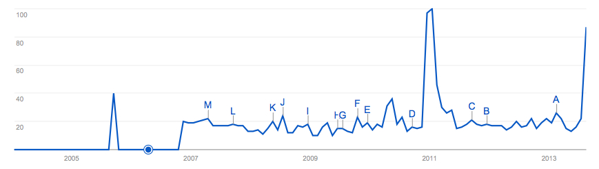
Knowing your (Indian) onions
I’m not sure if it has anything to do with the current precarious state of the Indian economy, but there are quite a few stories doing the rounds on the high prices of agricultural commodities in that country. Just today there were pieces on onions and on guar, which is the legume Cyamopsis tetragonoloba, whose gum has a role in fracking. But this onions business is nothing new. I am sure I remember similar panics in past years, and not just in 2011, which is the only search peak Google reveals:
Anyway, just for the hell of it, I waded into FAOSTAT’s onion price data for India and a couple of neighbouring countries, and this is what I got:
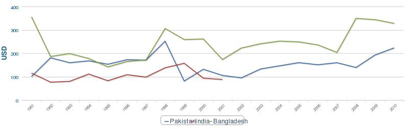
Some fluctuations, yes, but not much evidence or price spikes, surely. But why all that missing data from India (the red line)? Let the conspiracy theorizing begin!
Nibbles: Atlantic potatoes, Andean feasting, Lupin biodiversity, Vegetable grafting, Agrobiodiversity survey, Seed lending library, Lathyrus factsheet, Wild horses, School feeding
- Tracing Canary Island potatoes back to the Andes.
- Lupin diversity, all in one handy place.
- Bangladeshi women are grafting away.
- Wanna take a survey of “lessons learned about ways and means to conserve and use genetic diversity to build resilience to climate change in food and agriculture systems“? Uhm.
- Maybe they should survey this guy.
- Kew takes on the grasspea.
- I have my freedom but I don’t have much time…
- FAO spots a win-win-win in school feeding programme linked to family farms.
Nibbles: Superweeds, Old spices, Companies and nutrition, Bananas and cacao, Coffee pix, Potato restaurant, Millet processing, Aussie social herbarium, Rockefeller Story, Apple nutrition, And a bottle of rum…
- Those who like that sort of thing will no doubt enjoy this discussion at Biofortified of that recent paper about a herbicide resistance transgene possibly giving a fitness advantage to weeds. And more.
- As for me, I’d rather read about Neolithic spices. Or beer.
- Some food companies more committed to nutrition than others shock. But good to have the data.
- Bananas to the rescue in cacao plantations. If I had the willpower I’d try to mash it up with the previous thing. Anyway, coffee next?
- Eating more spuds in the Village. Eating more millets in the village.
- Australian National Herbarium gets a Facebook page.
- The history of the Rockefeller Foundation’s agriculture work. That would include the Green Revolution.
- Really confused Telegraph piece on heirloom and/or organic apples.
- I guess I missed National Rum Day. But I’m nevertheless glad that it exists.