- Ex-situ conservation of maize germplasm from different latitudes. You can do it, but not without some genetic changes.
- High density genotyping of the A.E. Watkins Collection of hexaploid landraces identifies a large molecular diversity compared to elite bread wheat. There’s plenty of interesting variation there, as you’d expect.
- Changes in barley (Hordeum vulgare L. subsp. vulgare) genetic diversity and structure in Jordan over a period of 31 years. No significant changes in the amount of genetic diversity in landraces collected in 1981 and in 2012, but later samples more homogenous and less locally distinct.
- Crop wild relatives range shifts and conservation in Europe under climate change. We’ll need genebanks.
- Isotope evidence for agricultural extensification reveals how the world’s first cities were fed. By opening up new land, basically, and never mind the fancy agronomic practices.
- Can the Introduction of Modern Crop Varieties in their Centre of Origin Affect Local Ecological Knowledge? A Case Study of Papaya in the Yucatan Peninsula. Yes, and not in a good way.
- Cryopreserved storage of clonal germplasm in the USDA National Plant Germplasm System. It really is a system.
- A meta-analysis of molecular marker genetic datasets for eastern Africa trees supports the utility of potential natural vegetation maps for planning climate-smart restoration initiatives. But you still have to do the trials.
- Global Diversity and Importance of Mycorrhizal and Nonmycorrhizal Plants. 72% of vascular plants have them.
- Factors associated with agrobiodiversity conservation: A case study on conservation of rice varieties in Barak valley, Assam, India. More connections means more varieties.
- Crop wild relative populations of Beta vulgaris allow direct mapping of agronomically important genes. Genotyping and phenotyping of 189 wild plants along a 10 km transect allows identification of disease resistance gene in the crops.
- Near Eastern Plant Domestication: A History of Thought. The punctuated-centric view is better, according to Occam.
- Fire and plant diversity at the global scale. They’re correlated, or at least associated.
Nibbles: Citrus conservation, Amazon civilizations, Agricultural adaptation, Farming First, Communicating impact, Church forests, Food Forever Initiative
- Conserving citrus in cryo.
- More rethinking of the early civilizations of the Amazon.
- Agriculture led to genetic changes in humans as much as in crops and livestock.
- Farming First goes all in on the SDGs. Oh, yeah, also I won the quiz. Ka-ching!
- Scientists, tell your stories for impact, including on policy.
- The sacred forests of Ethiopia, now there’s a story.
- The biggest story of them all: Food Forever!
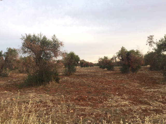
Squeezing olives
BTW, if you want to see what that “olive plague” we blogged about a few days ago looks like, here’s a despatch from the front lines by our intrepid photojournalist on the spot, Layla.
Incidentally, my attention has coincidentally recently been drawn to the Bioresources For Oliviculture (BeFOre) project (emphasis added):
The project aims at establishing a multi-lateral network of research and innovation staff active in OLIVE germplasm access, conservation, evaluation and exploitation, strengthening research capacities through the exchange of knowledge and expertise on a shared research programme focused on establishing integrated common protocols to phenotype and characterize plants at molecular, morphological and physiological level, and evaluating the olive oil quality related to varieties. Particular attention will be paid at establishing the international intellectual property rights for conserving and exchanging the olive genetic resources. The involvement of some Non Academic Organizations will allow the sharing of knowledge and ideas from research to all levels of the olive production chain, from plant propagation to fruit production and oil extraction (and vice-versa).
The bit about IPR is important because olives are not on Annex 1 of the International Treaty, at least for now, and one of the deliverables of the project is:
Core set of genotypes present in the main olive cultivar collections and grown under different agro-environmental conditions to evaluate their agronomical performance
Hopefully some of those genotypes are going to be of use against Xylella, either directly or through breeding.
Brainfood: Arracacha diversity, Mediterranean diet, Asian sheep & goats, Alpine flax, Breeding efficiency, Models, Domestication & seed size, Palm uses, CC & production, Insecticide & diversity
- Assessment of genetic relationships between cultivated arracacha (Arracacia xanthorrhiza Bancr.) and its wild close relatives in the area of domestication using microsatellite markers. Lots more variation in the wild, natch.
- Exploring Relationships between Biodiversity and Dietary Diversity in the Mediterranean Region: Preliminary Insights from a Literature Review. There has been an increase in dietary diversity, but of the wrong sort of diversity.
- Special issue Of Small Ruminant Research on “Genetic diversity of small ruminants in Asia”. From the Punjab Urial sheep to the goats of Myanmar.
- Genetic diversity of flax accessions originating in the Alpine region: a case study for an ex situ germplasm evaluation based on molecular marker. Past genebank conservation hasn’t been perfect.
- Enhancing genetic gain in the era of molecular breeding. It all starts with genetic variance. Hello, genebanks!
- Crops In Silico: Generating Virtual Crops Using an Integrative and Multi-scale Modeling Platform. Factor in gene editing and goodbye genebanks.
- Unconscious selection drove seed enlargement in vegetable crops. And not only vegetables, cereals too. But remember African rice?
- Palm economic and traditional uses, evolutionary history and the IUCN Red List. Globally, the more threatened palms are the less used.
- Impact of Climate Change, Weather Extremes, and Price Risk on Global Food Supply. The effect is not just on production, but also price.
- Identifying the landscape drivers of agricultural insecticide use leveraging evidence from 100,000 fields. In Kern County, California, crop diversity decreases insecticide us. But…
Some new germplasm databases, at least to me
Long-time readers may remember a post from 2012 summarizing some media reports of trouble at the Italian national genebank at the National Research Council (CNR), Bari. But maybe things are not as bad as were made out at the time. Or have got better.
I’ve just come across what seems to be a fairly new website for the genebank and it doesn’t give the impression of crisis. It lists 57,568 accessions from 184 genera and 834 species, which is more that was reported back in 1999 in WIEWS for ITA004, hopefully the correct code for the genebank in question (at least the address matches, if not the name of the institute). This is the geographic coverage of the collection:
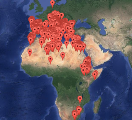
Impressive. Unfortunately, data on these accessions are not available in the European genebank database, Eurisco, and therefore they’re not in the global portal, Genesys, either. Hopefully that’s being rectified.
Since I’m on the subject of germplasm databases, I’ve also recently come across the Legume Information System, which focuses on material in the US genebanks. It has all kinds of data, but I just looked for germplasm from Italy to compare with what’s in Bari. Here’s the map for Medicago spp, showing growth habit in different colours (click on it to see it better).
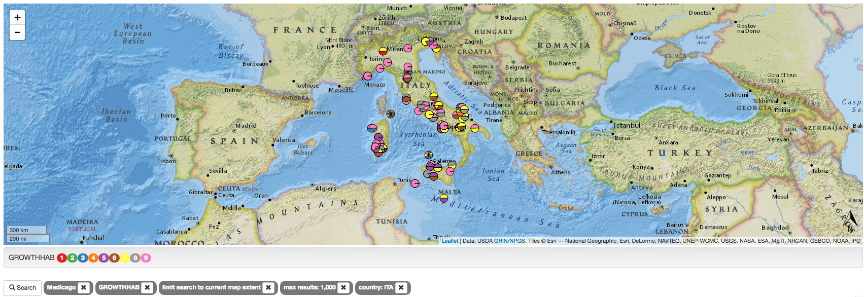
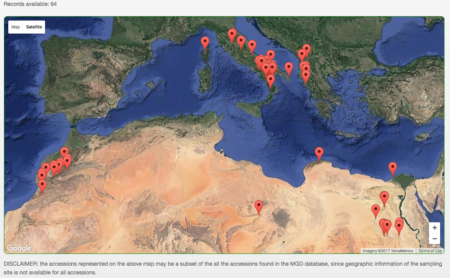
Compare and contrast with the ITA004 collection for the same species.
Which is why it’s a good idea to have all these data together in one place, i.e. Genesys.