- Quality characteristics of biscuits prepared from finger millet seed coat based composite flour. They’re nutritious. Crocodile Dundee on the tastiness of the iguana may, however, apply.
- Minerals and trace elements in a collection of wheat landraces from the Canary Islands. There are differences, but environment and agronomic practices could affect them.
- Lowering carbon footprint of durum wheat by diversifying cropping systems. Yes, by 7-34%, depending on how the diversification was done.
- Effect of shading by baobab (Adansonia digitata) and néré (Parkia biglobosa) on yields of millet (Pennisetum glaucum) and taro (Colocasia esculenta) in parkland systems in Burkina Faso, West Africa. Taro is a shade lover; grow it under néré, and vice versa.
- Ethnobotanical, morphological, phytochemical and molecular evidence for the incipient domestication of Epazote (Chenopodium ambrosioides L.: Chenopodiaceae) in a semi-arid region of Mexico. Good to know; I love epazote.
- Grape varieties (Vitis vinifera L.) from the Balearic Islands: genetic characterization and relationship with Iberian Peninsula and Mediterranean Basin. See the grand sweep of European history unfold.
- Microsatellite characterization of grapevine (Vitis vinifera L.) genetic diversity in Asturias (Northern Spain). No evidence of communication with the previous group.
- Plant economy of the first farmers of central Belgium (Linearbandkeramik, 5200–5000 b.c.). They were dope fiends.
- Selection for earlier flowering crop associated with climatic variations in the Sahel. Compared to 1976 millet samples, samples collected in 2003 had shorter lifecycle (due to an early flowering allele at the PHYC locus increasing in frequency), and a reduction in plant and spike size. So you don’t need new varieties, the old ones will adapt to climate change. Oh, and BTW, there’s been no genetic erosion.
- Do species’ traits predict recent shifts at expanding range edges? No.
- The domestication syndrome genes responsible for the major changes in plant form in the Triticeae crops. Failure to disarticulate and 6-rows in barley, in detail. Part of a Special Issue on Barley.
- The genetics of colour in fat-tailed sheep: a review. I didn’t know karakul had fat tails.
What did Osama’s neighbours grow?
Photographs of the surroundings of the bin Laden family compound in Abbottabad featuring assorted farmers, and other press reports of a vaguely botanical slant, naturally had me wondering what people grow around there. Using the location data from Google Maps in Droppr suggests that the main crops in terms of area are maize, various pulses and “other oil crops,” with small amounts of wheat and rice. Sugarcane shows quite a bit of production from a relatively small area. I was a bit surprised by the maize thing, but it seems to be borne out by an albeit somewhat dated census of agriculture for the district. Droppr does, however, seem to rather underestimate the importance of wheat. By the way, the “shaftal” mentioned as an important fodder crop during the rabi or winter season is probably Persian Clover (Trifolium resupinatum).

There are many trees shown in the various photographs but I’m afraid I can’t identify a single one. Did I perhaps see a mulberry among them? Maybe someone out there can help. Interestingly, Abbottabad was once called the City of the Maple Trees. At first I thought that couldn’t be Acer, but it seems from Wikipedia’s map of distribution of the genus that it could. There’s an interesting-looking study of the ethnobotany of the region’s trees that would probably reveal all, if I could afford it.
Brainfood: Australian obesity, Pigeonpea blight, Chocolate spot, Agroforestry, Andean potato agriculture, Salinity tolerance, Tree migration, Tea
- The Australian paradox: A substantial decline in sugars intake over the same timeframe that overweight and obesity have increased. Wait … there’s an Australian paradox too?
- Phytophthora blight of Pigeonpea [Cajanus cajan (L.) Millsp.]: An updating review of biology, pathogenicity and disease management. The wild relatives are sources of resistance, but that won’t be enough.
- Effects of crop mixtures on chocolate spot development on faba bean grown in mediterranean climates. Intercropping with cereals reduces the disease.
- Combining high biodiversity with high yields in tropical agroforests. It can be done, for smallholder cacao in Indonesia.
- And elsewhere … Cost benefit and livelihood impacts of agroforestry in Bangladesh. An entire book.
- Resource concentration dilutes a key pest in indigenous potato agriculture. Monocropping can be sustainable. Via.
- Community versus single-species distribution models for British plants. Overall, better stick with the single species kind, but it was worth a try.
- Quantitative trait loci for salinity tolerance in barley (Hordeum vulgare L.). They exist, and there are markers.
- Climate, competition and connectivity affect future migration and ranges of European trees. Well, doh.
- Quantifying carbon storage for tea plantations in China. All the tea in China…sequesters a lot of C. But plant type doesn’t count for much.
Food desert locator
Luigi and I had the same response to the USDA’s Food Desert Locator: wow!
[A] food desert [is] a low-income census tract where a substantial number or share of residents has low access to a supermarket or large grocery store.
Here’s a little section of the country.
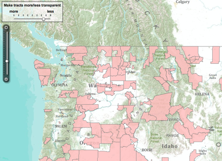
Astonishing in itself, what seems most thrilling is that the entire dataset is downloadable, which suggests all sorts of possible mash-ups: farmers’ markets, poverty, obesity, school journeys, Starbucks locations. The sky’s the limit. Not that correlation is causality, of course.
Nibbles: GBIF, Grains, Sorghum, Carnival, ECP/GR, Rabbits, Conference, Satoyama
- The evolution of the GBIF registry. If you need to ask, you don’t need to know. And if you don’t, you do.
- US farmers encouraged to try millets, sorghum — for birds. …
- … while in Kenya, Farmers turn to sorghum to boost their food security. They’re eating their beer.
- The latest Berry go Round blog carnival is up at Foothills Fancies. I liked the Red Filbert.
- The European Cooperative Programme for Plant Genetic Resources, known to its friends as ecp/gr, has a spiffy new website. But no RSS feed, so it’s unlikely we’ll be bringing you anything else of interest from that site.
- Battery rabbits back on the menu in England? A warren of contradictions, I tell you.
- International Conference on In Situ/On farm conservation and use of agrobiodiversity (fruit crops and wild fruit species) in Central Asia, 23-26 August, in Tashkent. Programme PDF here.
- “Japan should look to satoyama and satoumi for inspiration.” I thought it already had …