- The Commission on Genetic Resources for Food and Agriculture re-launches its website. And also the Global Livestock Production and Health Atlas (GLiPHA). Must be an FAO thing.
- “We are grateful to the governments who have made voluntary contributions to make this possible,” said Dr Shakeel Bhatti, Secretary of the Treaty’s Governing Body.
- Bighorn sheep at risk from climate change, computer says.
- The changing face of Japanese agriculture.
- “We are blurring natural boundaries: forests are no longer forests, meadows are no longer meadows. We have lost sight of eternity and infinity and are destroying nature for future generations.”
- Pope name-checks Svalbard Global Seed Vault.
Eden makes a comeback of sorts
It was over two years ago that we blogged about attempts to bring back Iraq’s southern marshes, and the agriculture they supported. Now, via Wired, there’s evidence from NASA of at least partial success.
A United Nations Environment Program assessment of the Iraq marsh restoration in 2006 concluded that roughly 58 percent of the marsh area present in the mid-1970s had been restored in the sense that standing water was seasonally present and vegetation was reasonably dense.
Here’s what this (partial) reclaiming of the marshes looks like from space:
But serious concerns remain: the water used for reflooding may not be sustainable as the population recovers and expands its agricultural efforts, and the region may have already suffered an irreversible loss of species diversity.
Would be nice to know to what extent traditional agriculture is also coming back. Maybe this could be discerned from the aerial images? What has happened to local landraces in the meantime?
Will climate change make protected areas useless?
Not for birds in Africa, apparently — and surprisingly, at least to me. 1 A recent paper looked at likely turnover of species in Important Bird Areas (IBAs) in Africa under a range of climate change scenarios. The results showed that although there would be significant shifts in the species composition of individual IBAs, overall about 90% of 815 endangered species “are projected to retain suitable habitat by 2085 in at least one IBA where they occur currently.” And some IBAs will become newly suitable for some species. Only a few endangered species will lose all suitable habitat from the IBA network.
Nevertheless, the authors acknowledge the importance of the shifts in species distribution and suggest a number of recommendations. In particular, the results highlight the need for regionally focused management approaches. For example, increasing the number and size of protected areas, providing ‘stepping stones’ between habitats and protected areas and restoring critical types of habitat, as well as ensuring that the current IBA network is adequately protected into the future.
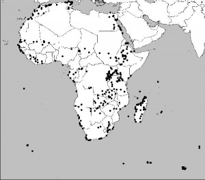
Sensible recommendations, which would apply all the more strongly to any similar network for crops wild relatives, say, which don’t by and large have the mobility of birds. 2 We need to carry out a similar resilience study for CWRs in protected areas, I would suggest. But also, do we know how good the IBAs are at capturing CWR diversity? I suspect when people look at CWR distributions in protected areas, it is mainly national parks and the like that they consider, rather than such specialized things as IBAs, but I could be wrong. 3 Here’s the distribution of IBAs in Africa. I seem to be having a thing about maps of Africa lately.
Yield trial sites mapped
Glenn Hyman has a great map over at AGCommons. It shows the sites in Africa where international crop networks carried out yield trials in the 1960’s, 70’s and 80’s (and some beyond). Here it is:
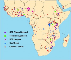
Would be interesting to compare with the various accessibility maps I posted a couple of days ago, and indeed with agroclimatic maps. No doubt Glen is doing it as we speak, and lots of other stuff too.
Read the interesting comment too: “Africa’s green revolutions will be fundamentally different from Asia’s — because Africa and Asia are fundamentally different, because times have changed, and because we have learnt a few tricks in the meanwhile!!”
Three different ways of looking at Africa
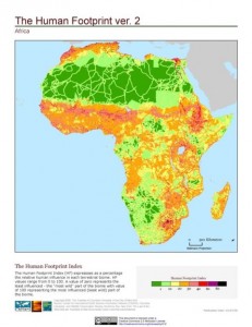
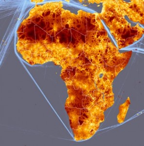
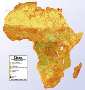
I ran the Last of the Wild dataset I talked about yesterday past our friend Andy Nelson, he of the accessibility map, and his reaction was that there was a quick paper, or at least an MSc thesis, in comparing that map with his and with the product of the GLOBIO project. Well, here’s what Africa looks like according to the three different methodologies, just to give you a taste. Quite similar, at first look, though we’ll have to wait for that MSc to be sure, I guess. Now, the question is, can such data be used to predict things like the amount of agrobiodiversity in farmers’ fields?
