The low level of activity last week on the blog was due to the fact that I was at the Botanic Garden Meise in Belgium participating in the annual meeting organized by the Genebank Platform. You can get a flavour of what happened from Twitter. And yes, I’m sorry, I should have told you all about #genebanks2017 before the meeting, rather than after. My bad.
Anyway, we’re finalizing the Platform’s website and you’ll be able to read all about it there soon. In the meantime, you can see a nice pic of the genebank managers and others working in some of the world’s largest and most used genebanks on the Crop Trust’s Facebook page.
One of those managers is Jean Hanson, and she’ll be retiring from her job at ILRI at the end of the year. In her farewell presentation to the group she summarized the history of plant genetic resources conservation, from the point of view of the international collections, in this way:
- 1970s: The Decade of Getting Started
- 1980s: The Decade of Doing
- 1990s: The Decade of Uncertainty
- 2000s: The Decade Upgrading
- 2010s: The Decade of Accounting
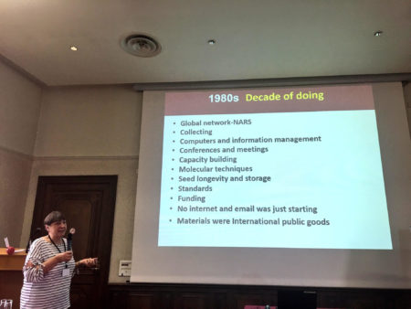
Jean didn’t say in her talk what she thought the 2020s were going to be the decade of, but she did share some thoughts during the Q&A. So let me open it up. What do you think? What do the 2020s have in store for the conservation of plant genetic resources for food and agriculture?
 A
A