National Geographic’s eight-month series on food has caught up with Colin Khoury’s blockbuster paper on how many crops feed the world. The infographic on diet similarity looks ok on the printed page, I guess:
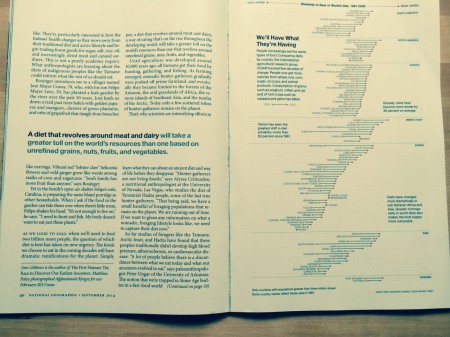
But it’s way cooler online.
Agricultural Biodiversity Weblog
Crops, livestock, microbes, pollinators, wild relatives, agroecosystems, foodways …
National Geographic’s eight-month series on food has caught up with Colin Khoury’s blockbuster paper on how many crops feed the world. The infographic on diet similarity looks ok on the printed page, I guess:
But it’s way cooler online.
One Reply to “Global diets visualized”