- ‘Do Not Privatize the Giant’s Shoulders’: Rethinking Patents in Plant Breeding. “Toll roads, not road blocks.”
- Implementation and cost analysis of a regional farm animal cryobank: an Italian case study. 2497 semen doses from 46 donor animals from 5 breeds cost €1550 annually, 83% for liquid nitrogen.
- Opportunities for Underutilised Crops in Southern Africa’s Post–2015 Development Agenda. Good for marginal land, good for nutritional diversity. But still not properly valued.
- Agricultural Management and Climatic Change Are the Major Drivers of Biodiversity Change in the UK. The first negatively, the second with mixed results. What about CWR specifically?
- Domestication Syndrome Is Investigated by Proteomic Analysis between Cultivated Cassava (Manihot esculenta Crantz) and Its Wild Relatives. The leaf and root proteins of two cassava cultivars were different from those of one wild accession. More work needed, methinks.
- Interhousehold variability and its effects on seed circulation networks: a case study from northern Cameroon. Wealthy households have access to more diverse sorghum seed sources.
Tracking SDG 2, unofficially and preliminarly
The unofficial Preliminary Sustainable Development Goal Index and Dashboard are (is?) out, courtesy of SDSN, and open for comment. Here’s the list of indicators they used (click to embiggen).
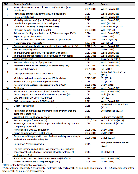
Focus on the indicators relating to SDG 2, which is “End hunger, achieve food security and improved nutrition, and promote sustainable agriculture.” That would be the following:
- Prevalence of undernourishment (% of population)
- Cereal yield (kg/ha)
Uhm. What happened to the double burden of malnutrition? And both rice and pearl millet are cereals: do we really want to use the yield of such a nutritionally narrow but agronomically heterogenous crop category to track agricultural development globally? Also, not much there relating specifically to Target 2.5:
2.5 by 2020 maintain genetic diversity of seeds, cultivated plants, farmed and domesticated animals and their related wild species, including through soundly managed and diversified seed and plant banks at national, regional and international levels, and ensure access to and fair and equitable sharing of benefits arising from the utilization of genetic resources and associated traditional knowledge as internationally agreed.
Because we do now have a good indicator, and indeed a decent baseline, for some aspects of that.
Good question
Workshop7: Natural Resources & Climate Change #TFFsummit2016 #uprootingassumptions pic.twitter.com/BmMHUpMq55
— Thought For Food (@thoughtforfood_) April 1, 2016
That’s Hannes Dempewolf doing his bit to uproot assumptions about crop diversity and genebanks at the Thought for Food Summit in Zurich. We’ll let you know if the assembled youth bought it.
How to get over your quinoa guilt trip, kinda
We’ve poked fun in the past at people who think that high prices for quinoa are taking food out of the mouths of poor farmers in Bolivia and Peru, but here’s a confession.
We didn’t have actual objective evidence that this was not the case. Just a gut feeling, based on experience and knowing people who know quinoa farmers. Oh, and lots of research on other commodities by Nobel prize winner Angus Deaton.
Now we do have evidence, from real agricultural economists, which I’ve written about at length (and thanks for giving me the length) at NPR’s The Salt.
Your Quinoa Habit Really Did Help Peru’s Poor. But There’s Trouble Ahead.
Bottom line, from the researchers:
“The claim that rising quinoa prices were hurting those who had traditionally produced and consumed it [is] patently false.”
And that goes for nutrition too, as the article explains.
So what’s the trouble ahead? There are three, actually, two of which will be familiar to readers of this site.
First, the boom in export markets is focussed on very few of the 3000 or so extant varieties of quinoa, which hold the future to further adaptation of quinoa as environmental conditions change. Payments for Agrobiodiversity Conservation Services could help to solve that.
Secondly, the sustainability of quinoa growing in the high Andes is in doubt because more intensive practices are resulting in soil erosion and degradation. No easy solution, unless the farmers band together and implement some minimum sustainability standards. That might give them an edge in an increasingly competitive market, the basis for confronting perhaps the biggest threat …
Prices have already started to drop, and are already well down on their peak. That’s hardly surprising. High prices have sucked in global competitors. Farmers in South America are holding on to their stocks in the hope that prices will rise again, but few of the people I spoke to have any expectation that they will rise.
As Marc Bellemare, one of the agricultural economists, told me:
“If we’re going to rejoice when prices go up, maybe we should worry when prices go down.”
A quick, selective trawl in our archives produces:
- Fairtrade quinoa vodka hits the stores on APRIL 15, 2010
- The quinoa story: it’s complicated on MARCH 28, 2011
- Quinoa phylogenetics unraveled on JULY 15, 2011
- Quinoa in Pakistan on JANUARY 2, 2013
- Quinoa: it’s still really complicated, and nobody cares about it in December on JANUARY 24, 2013
- United colours of Quinoa on FEBRUARY 20, 2013
- The great quinoa debate: statistics to the rescue on SEPTEMBER 11, 2013
- Quinoa misconceptions unmasked on MARCH 28, 2014
- Quinoa backlash backlash recap recap on APRIL 27, 2014
Global Food Policy Report the usual downer
IFPRI’s 2016 Global Food Policy Report: How We Feed the World is Unsustainable is out and it makes for sobering reading. The press release doesn’t pull any punches either.
Land area the size of Nicaragua is lost due to drought and desertification every year, putting 200 million small-scale farmers in Africa south of the Sahara at high risk of climate change
The Western diet is unsustainable—feeding just one Westerner for one year emits as much greenhouse gas as seven round trip drives from New York to Los Angeles
Thankfully, some solutions are also suggested:
The development of climate-ready crops, which can lead to more efficient water use and improve yields, are key to feeding a growing population and adapting and mitigating against climate change.
Though you’ll look in vain for a mention of genebanks as underpinning efforts to roll out what I believe should properly be called climate-smart crops. “Climate-ready” was supposed to have been quietly deep-sized some time back, I’m reliably informed, as being too reminiscent of the draeded “Roundup-ready.”