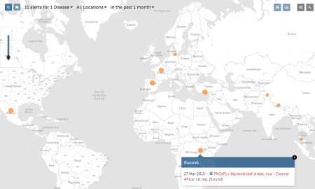
I think we may have blogged about ProMED before, but I don’t feel at all guilty about another shout-out. I have no idea to what extent the whole thing is automated, but if there’s anything in the press about a disease — of plants, livestock or humans — it gets a little write up on the website, and a dot on the map. And you can sign up for email alerts or subscribe to an RSS feed, or indeed to their Twitter feed or Facebook page if that’s your vice. I sometimes dream of doing something similar for all kinds of threats to agrobiodiversity.
And while we’re on the subject, just a reminder that there’s a new new app for Pacific pests and pathogens, courtesy of those nice people at Pestnet.

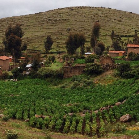 I was in South America for the past couple of weeks, which is why blogging has been, well, slow. One of the places I visited was the
 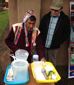 CIP staff have also been training local people in the production of botanical seed, as part of a project implemented by the