- The plantation roots of the food system need to be pulled out.
- And biodiversity collections decolonized.
- And protected areas too while we’re at it.
Nibbles: High edition
- South Africa looks to legalize weed.
- Quick gallop through the chemistry of food. Weed brownies not covered.
- Is your salad this diverse? Weed not included.
Brainfood: Cover crops, Forest management, Mixtures, Diverse landscapes, Ethiopia and CC, Mapping settlements, Fonio, Peach, Aging seeds, African diversity, Svalbard, Vegetables
- The hidden land use cost of upscaling cover crops. You’d need to devote 4% of the arable maize area of the US to cover crop seed production to have enough cover crop seed for the maize cultivated area. That’s a lot. The answer: better cover crop genetics and agronomy.
- The first rapid forest inventory and resource use assessment of Dashtijum Nature Reserve, Tajikistan: a mixed methods approach. Fancy maths says you need to restrict grazing in these fancy walnut-fruit forests to prevent further degradation.
- Towards intercrop ideotypes: non-random trait assembly can promote overyielding and stability of species proportion in simulated legume-based mixtures. In silico modelling shows that not all mixtures outyield pure stands, but it’s hard to predict which will.
- Fixing our global agricultural system to prevent the next COVID-19. Beyond the land sparing vs sharing dichotomy, to multifunctional landscapes, supported by policies and markets.
- The role of climate in the trend and variability of Ethiopia’s cereal crop yields. Higher temperatures during 1979–2014 correlated with lower yields in much of the high potential area. So, trouble ahead.
- Precise mapping, spatial structure and classification of all the human settlements on Earth. Because they’re there, that’s why.
- Genetic Resources and Varietal Environment of Grown Fonio Millets in West Africa: Challenges and Perspectives. Lots of work to be done by enterprising breeders.
- Genetic Resources, Breeding Programs in China, and Gene Mining of Peach: A Review. Lots of work has been done by enterprising breeders.
- Patterns of mitochondrial DNA fragmentation in bread wheat (Triticum aestivum L.) seeds under ex situ genebank storage and artificial aging. Possible biomarker for seed viability, but differences between natural and artificial aging.
- Ancient genomes reveal complex patterns of population movement, interaction, and replacement in sub-Saharan Africa. Present day hunter-gatherers represent a contraction of a previously widespread human population, which interacted in complex ways with subsequent waves of pastoralists and farmers.
- The past shall not begin: Frozen seeds, extended presents and the politics of reversibility. So Svalbard apparently represents the politics of reversibility made concrete. Literally.
- The Role of Vegetable Genetic Resources in Nutrition Security and Vegetable Breeding. How about reversing the slide of traditional vegetables, eh? Those enterprising breeders needed again.
Nibbles: Carver, Banana phenotyping, Wild wheat project, Chinese chillies, Tea book
- George Washington Carver‘s legacy lives on.
- Finding drought-resistant bananas: the movie.
- Mining wild wheat. Again.
- The definitive book on hot peppers in China. And I’ll save you a few clicks, here’s the video alluded to in the review.
- The definitive book on tea. Not just China either.
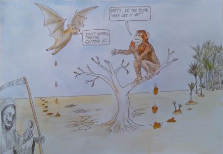
Chimps shit in the woods
Our friend Alex Chepstow-Lusty and co-authors have another paper out on the forests of Central Africa in the late Holocene. The import of this latest piece of work is that when the forests bounced back 2000 years ago from the fragmentation caused by climate change 500 years before, they did so at least partly thanks to forest animals. As ever with Alex, poo is involved, on this occasion chimp poo. We can thank it for the spread of oil palm across West Africa, it seems. Chimps and others seed poopers may, alas, not be so helpful for the forest’s recovery from the current, anthropogenically caused climate change.