I’m not sure if I said here that I visited IPK, the German national genebank, a few weeks ago. I did on Instagram.
Great facilities, great people, great work: but, though bigger and better resourced than average, in most ways like many other genebanks around the world. Except, that is, for the Assyrian relief in the entrance hall.

Well, the plaster cast of the Assyrian relief anyway. Nobody seemed to know where the original was, but there was general agreement that the copy was there because it depicted plant breeding. Of course, I took that as a challenge, and after a few minutes playing around with Google’s image search feature, I ran it to earth at the Met.
Each register of imagery shows a pair of supernatural figures flanking a stylized “sacred tree.” Further sacred trees can be seen to the left, and similar imagery continued around the room from which this slab came. The tree is thought to represent the prosperity and agricultural abundance of Assyria, and perhaps on one level the state itself. The supernatural figures are protective, and similar to those shown at larger scale throughout the palace. The gesture performed by the bird-headed figures with bucket and cone has been much discussed. One suggestion is that it symbolizes the fertilization of the land through the imagery of artificial date-palm fertilization, in which male date-spathes are used to fertilize female plants. The Assyrian term for the cone, however, seems to be “purifier,” and it is therefore likely that the symbolism has as much or more to do with magical protection.
So, maybe plant breeding, maybe not, but well worth having in the entrance lobby to a plant breeding institute containing a genebank.
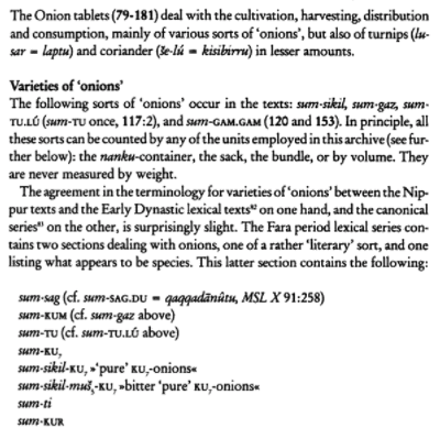
But in locating the stela I ran across an article on Mesopotamian agriculture from the Oriental Institute that mentioned something called the Philadelphia Onion Archive.
No way to let that go either, naturally. It turns out that the Philadelphia Onion Archive really does consist of an archive of material on onions, kept in Philadelphia in the unwieldy shape of numerous clay tablets inscribed in cuneiform in the Akkadian language. Fortunately, there’s a translation online. Which means we know how many types of onions were grown during the reign of King Shar-Kali-Sharri, over 4,000 years ago.

And for how many places around the world can we say that even now?