- Do you have a small parcel of land in the Netherlands that you would not mind being used to test soybean varieties? Non-GMO, mind.
- Kew has a couple of new online resources on Neotropical plants.
- We need an international early warning system for cassava problems.
- “Is there anyone in Bangladesh to look deep into the workings of the biocrats who are bent on advancing the cause of giant companies at the expense of the people’s long-term food security?”
Nibbles: Drought, Babylonian gardens, Armenian flora, Urban veggies
- NASA says there has not been a drought-driven decline in plant productivity after all. Yeah but where’s my jet-pack, guys?
- Hanging Gardens of Babylon had date palms and tamarisk. At least.
- Edible wild Armenian plants.
- AVRDC on how to grow vegetables in all sorts of different containers.
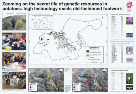
Mapping potato genetic resources
And speaking of genetic erosion:
Land use tendencies between 1997 and 2005 shows that the total cropping area dedicated to improved cultivars has grown fast while the area reserved for native-floury and native-bitter landrace has remained more or less stable. Reduced fallow periods for existing fields and the gradual incorporating of high-altitude virgin pasture lands sustain areal growth. While areas of improved cultivars are proportionally growing fastest at extremely high altitudes between 3,900 and 4,350 m of altitude, overall cropping intensity or fallowing rates are inversely related to altitude. No evidence of a straightforward replacement of one cultivar category by another was found.
That’s from the winners of the third prize at the SCGIS/ESRI/SCB International Conservation Mapping Contest, Traditional Cartography section: CIP’s Henry Saul Juarez Soto, with Franklin Plasencia and Stef de Haan. Worth reading the whole thing.
Brainfood: Genetic isolation and climate change, Not a Sicilian grape variety, Sicilian oregano, Good wine and climate, Italian landraces, Amazonian isolation, Judging livestock, Endosymbionts and CCD, Herbal barcodes, Finnish barley, Wild pigeonpea, Protected areas, Tree hybrids
- The impact of distance and a shifting temperature gradient on genetic connectivity across a heterogeneous landscape. Climate change bringing formerly genetically isolated populations together, possibly increasing adaptive potential.
- Intra-varietal genetic diversity of the grapevine (Vitis vinifera L.) cultivar ‘Nero d’Avola’ as revealed by microsatellite markers. 15 distinct genetic group among 118 plants from 30 Sicilian vineyards seems quite a lot.
- Emerging cultivation of oregano in Sicily: Sensory evaluation of plants and chemical composition of essential oils. More from Sicily. Wild is best.
- Effect of vineyard-scale climate variability on Pinot noir phenolic composition. Its complicated. But at least Pinot noir is not like Nero d’Avola. Or is it? Oh, crap.
- Landraces in Inland areas of the Basilicata region, Italy: monitoring and perspectives for on farm conservation. “Farmer-maintainers” of landraces tend to be old and isolated. Interesting stratified sampling strategy. Basilicata? They grow horseradish there, don’t they? They do indeed.
- Critical distances: Comparing measures of spatial accessibility in the riverine landscapes of Peruvian Amazonia. GIS-calculated time-based accessibility influences rural livelihoods and land use pressure. And agrobiodiversity? Apply to Basilicata next?
- A morphological assessment system for ‘show quality’ bovine livestock based on image analysis. Image of side of animal fed through neural network almost as good as experts in determining how beautiful the animal is. well there’s a triumph for science.
- Endosymbionts and honey bee colony losses? Something else to add to the list of possible causes of colony collapse disorder.
- Commercial teas highlight plant DNA barcode identification successes and obstacles. About a third of products revealed signatures of stuff that was not listed in the ingredients, but that could be due to a number of reasons.
- What would happen to barley production in Finland if global warming exceeded 4°C? A model-based assessment. Nothing good, surprisingly. Better get some new varieties, I guess.
- Cajanus platycarpus (Benth.) Maesen as the donor of new pigeonpea cytoplasmic male sterile (CMS) system. Gotta love those CWRs.
- Australia’s Stock Route Network: 1. A review of its values and implications for future management. Established for movement of livestock before trucks and trains, but has lots of endangered species and communities. Great value on many fronts, in fact. Needs proper governance though.
- Should forest restoration with natural hybrids be allowed? Yep.
Unlocking a presentation on unlocking agriculture’s past
The talk that Jacob is planning to give later today at the National Geographic store in Madrid (and you can follow online) is now available on Slideshare.
LATER: I forgot to use a hashtag, but you can see my live-tweeting of Jacob’s talk by searching for his name. Maybe Jacob can tell us if the video will be available in due course. And no, he didn’t answer my online question about the difference between oca and potato. Wimp.
