 Jeffrey Walck and Kingsley Dixon have a piece on genebanks in December’s Nature entitled “Time to future-proof plants in storage.” It says some important things, but in a way that suggests that nobody has thought of them before, or has done anything about it, which I think needs to be countered. The article is behind a paywall, alas.
Here’s the crux of Walck and Dixon’s beef.
At low temperatures, seeds can remain viable for hundreds if not thousands of years. Herein lies the problem: such seeds are literally frozen in time, a snapshot of the genetic diversity of a species at a particular point. Attempts to revive a seed in future habitats very different from those in which it developed could be doomed to failure. A germinating seed is genetically programmed to respond to a precise interplay of temperature and moisture that determines the climatic conditions in which it can best develop. In an environment that lacks the right temperature and moisture balance — which is likely to be disrupted by climate change — a seed will either fail to germinate or the seedling will perish soon afterwards (see Fig. 1).
What are their suggestions for getting around this problem? Here’s a summary:
1. Harvest as much genetic diversity as possible, including at the edge of species ranges, and at different points in time. And harvest large quantities of seed whenever possible.
2. Screen the plants for their adaptation to different environments. “For instance, subjecting seedlings to increased temperatures could allow the selection of those with higher heat tolerance.”
3. Use climate models to identify areas where different populations will be best adapted. “…climate change will alter the home range of a species, so restorers can be sure to reintroduce seeds in places that will match their particular germination requirements.”
4. “Policy-makers must get involved too: a comprehensive international agreement is required to coordinate the collection of genetic material, particularly for cross-border wild species.”
So, that would be collect properly, evaluate, match seeds to environments and put in place an international policy infrastructure. Doh! I really can’t see anything in that list that genebanks are not already trying to do. Can you? Maybe they’re not doing it as well as they might, and certainly the policy environment is still not ideal, but there’s surely nothing particularly new about these recommendations. Sure, it is always useful to remind a community about best practices, but it would have been nice to point out that genebank managers around the world know what these are, and are in fact trying to follow them.
If they had wanted to suggest something that isn’t already in place, why didn’t they mention the pressing need for a comprehensive global information system? Now that would be an improvement. And yes, we — and they — are working on it.
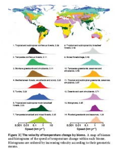
![]() Well, in terms of distance along the Earth’s surface, about 400 m per year on average, ranging from 80 m per year in mountainous regions to 1.26 km per year in deserts. That’s according to a new paper in Nature by Loarie et al. 1 Compare that with figures of postglacial migration rates of <100 m per year for some trees. Here’s a map of the speed of temperature change by biome from the Nature paper (click to enlarge).
Well, in terms of distance along the Earth’s surface, about 400 m per year on average, ranging from 80 m per year in mountainous regions to 1.26 km per year in deserts. That’s according to a new paper in Nature by Loarie et al. 1 Compare that with figures of postglacial migration rates of <100 m per year for some trees. Here’s a map of the speed of temperature change by biome from the Nature paper (click to enlarge).

 Our friend Andy Jarvis has been explaining to the readers of