- Chocolate made from camel milk for the first time. And last?
- “Slow rusting” genes from Ethiopian wheat landraces.
- Brits (and Yanks, for that matter) look for ancient trees in woodlands becoming ever less distinctive.
- The world needs GM rice, but alas “the environment for accepting genetically modified crops is not as good as it should be.” Meanwhile, IRRI keeps hammering away at drought tolerance and resistance to other assorted stresses. It’s hard being rice.
- ICAR looks at the likely effects of climate change on crops and what can be done about it.
- Climate change making Soay sheep (and, incidentally, European fish too) not just smaller, also darker. Speaking of fish, there’s trouble in the Zambezi too, but not necessarily due to climate change. Although…
- A Greek seed bazaar.
- FAO turns to barn owls to stop Laotian rodent plague.
- US food policy destinations on Google Maps.
- Vermicomposting is good news for the Indian textile industry. Vermicomposting: I like saying that word.
Monitoring plants of “Community interest” in Europe
There’s been an item in the news the last couple of days to the effect that “[a] report by the European Commission shows that habitat and wildlife protection targets across Europe will be missed…” Digging a bit deeper into that seemingly simple statement led me to a hitherto unknown (to me) world of EU rules and regulations and reporting requirements.
Let’s start at the beginning. There’s a thing called the Habitats Directive (1992). This requests all Member States “to monitor habitat types and species considered to be of Community interest.” It’s unclear to me how they were selected (perhaps someone out there can tell us), but these species are listed in various annexes to the Directive, though that sounds more simple than it is:
Where a species appears in this Annex but does not appear in either Annex IV or Annex V, the species name is followed by the symbol (o); where a species which appears in this Annex also appears in Annex V but does not appear in Annex IV, its name is followed by the symbol (V).
Anyway, Article 17 provides for regular reports on implementation of the Directive, and the report “for the period 2001-2006 for the first time includes assessments on the conservation status of the habitat types and species of Community interest.”
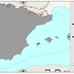
The website which houses the Article 17 reports is, well, complicated, but well worth exploring. The most interesting bit from an agrobiodiversity perspective is the page from which you can get species reports. These include all kinds of information about the status of those “species considered to be of Community interest,” country by country (there’s also an overall summary). Some of these species “of interest” are crop wild relatives such as Allium grosii, an endemic to the Balearic Islands (click the map to enlarge it).
There’s a few more CWRs in those annexes, though not all that many. A Hungarian Pyrus, for example. Any chance to get a few more on there? The bureaucratic infrastructure and mechanism for regular monitoring and early(ish) warning of any threats would seem to be well and truly in place, European Union-style.
Mapping our blogging
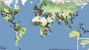
On slow news days my mind turns to things meta. So here’s a map of our agrobiodiversity blogging. You can get a better, interactive one by clicking “Map” up on the menu bar at the top of the page.

Considering we haven’t been geo-referencing from the beginning, I think that’s not too bad a geographic coverage of the world’s agriculture. A few gaps, though. We’ll see what we can do about that.
Livestock landraces and marginality in Europe
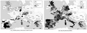
Visually, by comparing the map of INDEX2 (Fig. 6) [right] with the one of the distribution of breeds (Fig. 2) [left], it can be seen that the studied breeds seem to be consistently located in regions defined as marginal by the indices.
Well, maybe. Click on the image to see better. But it seems a stretch to me, and the more rigorous logit analysis that the authors subject the data to isn’t exactly overwhelming. If I understand it correctly, the best that a combination of various proxies for marginality can do in predicting the presence of local sheep and goat breeds is 19%. And that’s with breed distribution data which seems to be biased towards marginal areas anyway.
Local sheep and goat breeds are generally argued to be remarkably well adapted to marginal rural areas.
That’s certainly a dominant meta-narrative, and not just for livestock, for agrobiodiversity as a whole. I may even believe it. But not a huge amount of evidence for it here.
Nibbles: Agroforestry, Forecasts, Coffee, Pigs, GIS, Potatoes
- North American Agroforestry; new edition of an old book.
- “Supply will go up, demand will go up, and real prices of grain and oilseeds also will go up” over next 10 years. That’s nice.
- Nescafe coffee goes green in Philippines.
- Rare-breed jamon at $490 a leg. Not so marginal any more.
- Visualizing Tweeter biodiversity observations. Over to you, Luigi.
- Ireland hosts International Potato Genome Sequencing Consortium meeting. Well, obviously.

