One of the authors, Michael Mackay, tells us about a new book that is sure to set pulses racing.
A question anyone involved in crop improvement — breeders, pre-breeders, genebank managers, genetic resources experts of all hues — has invariably asked is: where can I find some new genetic variation to overcome this nasty new problem that’s hammering productivity in my region? We all know there is an enormous reservoir of plant genetic resources held in ex situ or in situ around the globe. To use a cliché that’s been much used but never bettered in this context: it’s all too often like looking for a needle in a haystack. Sure, molecular biology is increasingly predicting, and occasionally even delivering, a more rapid pathway to identifying and using those elusive new genes or alleles. But are we making the best possible use of the information that’s out there already?
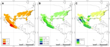
Enter Applied Mathematics and Omics to Assess Crop Genetic Resources for Climate Change Adaptive Traits. This book, just published by CRC Press, applies the latest statistical techniques to explore plant genetic resources data of all different kinds. The aim is to help researchers create manageable, trait-specific, sub-sets of germplasm. These should end up being best-bet candidates for evaluation and further research. Think of core collections, but skewed towards — enriched for — particular traits, rather than efficiently covering diversity overall. Think of a smaller haystack with a much better chance of containing that needle.
While the book proposes a general conceptual mathematical framework for exploring how different data can be used to estimate the likelihood of specific variation existing within a given accession, there is a particular focus on climate change. It includes discussion of how genetic resources can be used to mitigate and adapt to climate change, and how different plant traits are likely to become more important as the climate changes.
So, as genebanks accumulate information on their germplasm — making the haystack ever bigger — and plant breeders come up with ever better ways to use that elusive needle, this book identifies an opportunity to bring these two communities together in the cause of adaptation to climate change. The maths needed to facilitate a more effective ‘mining’ of novel genes and alleles from the world’s genebanks is certainly fancy. But this books puts it within the reach of anyone with a computer. Or a pitchfork.