- Herbarium specimens reveal the footprint of climate change on flowering trends across north-central North America. 2.4 days per °C.
- Carotenoid profiling in tubers of different potato (Solanum sp) cultivars: Accumulation of carotenoids mediated by xanthophyll esterification. 60 cultivars, including landraces, fall into 3 main groups. Need to keep an eye out for those xanthophyll esters.
- Buckwheat honeys: Screening of composition and properties. In other news, there is monofloral buckwheat honey in Italy and E. Europe. But not as much as the producers say.
- Using geotagged photographs and GIS analysis to estimate visitor flows in natural areas. Very cool, but try as I might I cannot think of an application in agricultural biodiversity conservation. Maybe you can.
- Quiet sustainability: Fertile lessons from Europe’s productive gardeners. Food gardening in Europe’s cities is not about an “urban peasantry” putting essential food on the table. And it’s not about expousing a yuppie alternative lifestyle. It’s just about the sheer fun of it.
- Introgression and the fate of domesticated genes in a wild mammal population. Coat colour polymorphisms in wild Soay sheep was caused by admixture with more modern breed 150 years ago.
- Catholicism and Conservation: The Potential of Sacred Natural Sites for Biodiversity Management in Central Italy. So apparently there’s a “common view that Christianity is anti-naturalistic.” Well, it’s wrong. What’s Christianity’s view of agrobiodiversity, I wonder?
- Comparative transcriptomics reveals patterns of selection in domesticated and wild tomato. DNA differences due to selection at 50 genes, transcription differences at thousands.
Nibbles: Indian farmer, Indian farming landscape, Guatemalan protected areas, Old phones, Geo-data, HarvestPlus funding, Cavia, Agronomy, Bee bank, De-extinction
- Bhogpur farmer Subash Chander Misra gets Plant Genome Savior Farmer award 2012 for pear conservation.
- While a whole farming system gets protected in Kerala.
- Hope it doesn’t go the way of protected areas in Guatemala. Maybe they need old mobile phones. Or a better roads or urban expansion dataset. Or maybe just their own maps.
- UK government puts money where mouth is with grant to HarvestPlus. For things like this from ICRISAT. And have you seen the BBC slideshow?
- Funnily enough, nobody talking about guinea pigs as a solution for malnutrition.
- How Australian agriculture improved its water use efficiency. Clue: it’s not one thing. Good to be reminded, yet again, that’s it’s not necessarily always and only about the diversity. Keeps us centred.
- Bees get a bank?
- The de-extinction debate rumbles on. Centred, did someone say?
Atlas of Living Australia in the spotlight, again
Commenting on a comment on my slightly disappointed take on a couple of new spatial datasets yesterday, our regular reader Glenn Hyman, another CGIAR CGI uber-geek, muses thus:
If I was a young GIS geek, I think I would concentrate on how to create online applications for the non-expert.
Do you mean, Glenn, the kind of “online application for the non-expert” which the Atlas of Living Australia aspires, with considerable success, to be? Which coincidentally is being so actively discussed on Twitter just now. 1 And which I need to road test again very soon, as there have been significant changes since the last time I took it around the block.
@AgroBioDiverse Profile: https://t.co/oCIvoRaEnd The presentations will probably be on line shortly.
— Jim Croft (@jim_croft) June 12, 2013
Playing around with new spatial datasets
Kai Sonder, CGIAR GIS geek extraordinaire, alerts us to the release of a couple of cool new global geospatial datasets, on roads and urban expansion. You need GIS software to get the full benefit of these, but at least for the city one some of the data 2 are available in KML format. This is what you get when you map in Google Earth Yerevan’s present extent together with the location of wheat germplasm accessions from Genesys.
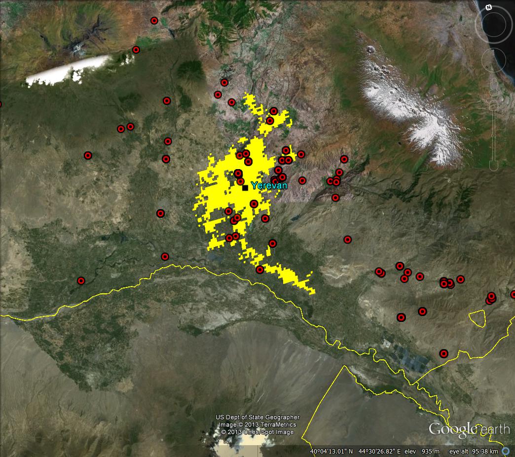
Clearly some of those samples must have been collected a while back, when the city was perhaps smaller. And this is what you get when you map Armenia’s roads, again with wheat, but this time in DIVA-GIS.
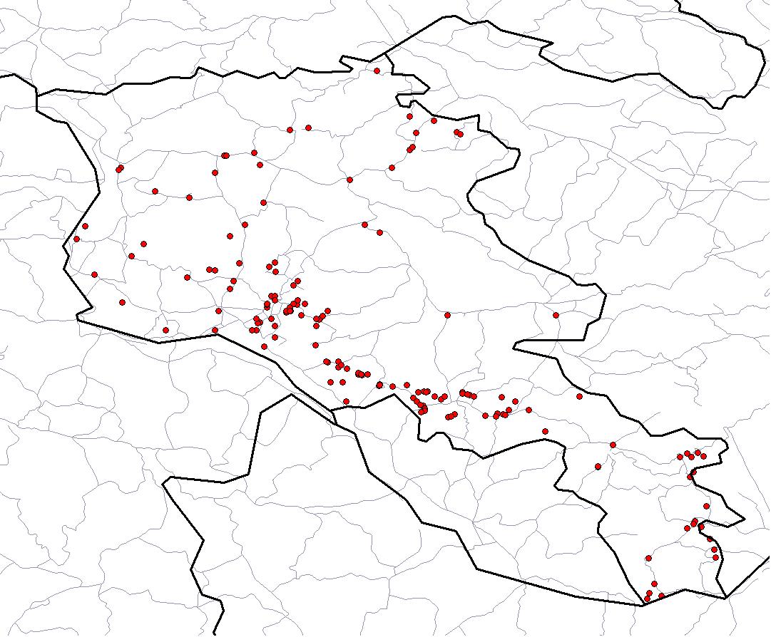
A nice enough illustration of a bias towards collecting germplasm near roads that has been looked at in quite a lot of detail in another part of the world. But I just can’t help thinking these resources should be easier to play around with. Especially together.
LATER: Spurred on by Cedric and Jeremy, let me spell it out in more detail. What I would have liked is for both datasets to be available in their entirety in a format allowing easy upload to Google Earth. You will tell me that if you’re really, seriously interested in analyzing these datasets, together with others (like that Armenian wheat stuff from Genesys, say), you can do it by downloading the shapefiles, which is the standard format for such things, and opening them in any decent GIS software. And you’d be right. But isn’t there another kind of user? The one who wants to just, well, play around. Maybe even as a preliminary to more serious analysis, but initially just play around. That user is not well served by these resources. I know because I am that user, and I don’t feel well served.
Mapping more life
Just a quick note to say that the Map of Life, which we blogged about a year back, now covers plants too. Still a bit weak in the sharing department, after a quick glance, but I’ll reserve final judgement until I’ve had more of a chance to play with it.