An investor tests out MAPPR

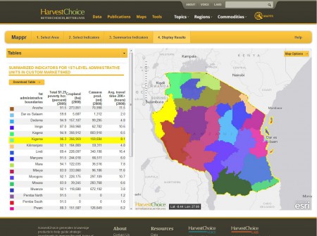
Using MAPPR, a policymaker can identify regions of a country with high concentrations of both poverty and cropland, or an investor thinking about building a food-processing plant can search for locations that combine production of sufficient quantities of a particular crop with good access to markets.

Well that sounds like fun. I’m an investor. I’m thinking of ploughing my hard-earned cash into a cassava processing plant in Tanzania. Let’s see if MAPPR can help me.

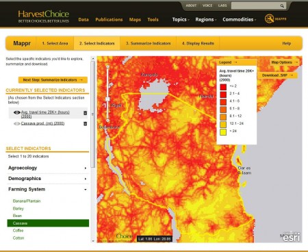
You can indeed produce a map of both cassava production and average travel time for Tanzania, and fairly easily. Here’s what you get for “Median travel time to human settlement of 20,000 or greater population”, for example.

You can also very easily produce a map of cassava yield, production and area in Tanzania. You do that by clicking on the little eye thingie on the left of the map, where is says “Cassava Prod. (mt) (2000).” Problem is, when you do that, your map of travel time disappears, and I can see no way of showing the two together to tell me where short travel time to a village coincides with high cassava production, assuming that’s a sensible thing to want to know. Short of printing out the two maps on transparent paper and looking through the two of them on a light table, that is. Gosh, I used to do that back in the 80s. Ah, but you can’t even print the maps out easily. You have to do the screen capture thing. As an investor, I’ve already given up on MAPPR.

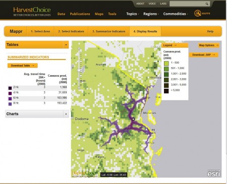
But I’m not an investor, I’m a sucker for punishment, so I persevere. Maybe this “Summarize indicators” option will help me. Well, it does, thankfully. You can pick a specific location, or define a custom area, or a domain (an agroecological zone, say), and MAPPR will give you summary information for both travel time and cassava production. So, for example, this is the result of combining “Median travel time to human settlement of 20,000 or greater population” and “Cassava Prod. (mt) (2000)” for a specific location I chose at random.

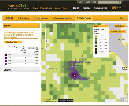
Perhaps somewhat more helpfully to our imaginary investor, you can also get a map of travel time to a specific location, and cassava production within different travel times of that location.

Unfortunately, sharing this result is problematic. Basically the only thing you can do is a screen grab. Trying to export the shapefile so you can use the map in your own GIS, and maybe do further analysis, or combine it with your own data (cassava accessions in genebanks, anyone?), or even produce a nice image, results in the dreaded “404 – File or directory not found. The resource you are looking for might have been removed, had its name changed, or is temporarily unavailable.” And if you try to go back to your result, MAPPR flings you back to the beginning and you have to start the whole process over again. Ouch.

So actually, if you are “an investor thinking about building a food-processing plant can search for locations that combine production of sufficient quantities of a particular crop with good access to markets” I think you will find MAPPR pretty useless. You’d have to have a number of a priori options for siting your plant, and then you could go through all of the above for each of those sites, and then maybe by comparing the results pick your best bet. But you wouldn’t be able to work out where the very best place to site your plant in the whole of Tanzania might be. And you wouldn’t be able to export your results and do your own analysis based on the data that is available.

And even if you could, because let’s say I’ve missed something in the functionality, you wouldn’t be able to share your results in a way that lets you or others present them nicely, let alone explore them further.

But don’t take my word for it. You be that policymaker in the blurb that wants to “identify regions of a country with high concentrations of both poverty and cropland.” If you can do that, I promise to host the results here. And apologize to the MAPPR team. Until then, I maintain that this is not a tool that the average policymaker or investor is going to use, at least more than once. And neither will I. Believe it or not, I’m really sorry about that.

Brainfood: Molecular adaptation, Chicken genetic resources databases, Cacao diversity, Pistacia molecular diversity, Glycene diversity, Sheep breeding, Bt cotton, Argan oil

Nibbles: Aquatic mapping, Biofortified millet, Indian agriculture, African agriculture, Restoration, Online flora, Farm Bill, Right to Food, Elk farming, Forestry fellowship, Breadfruit, Foods and climate change

Mashing up the Global Forest Disturbance Alert System

So here’s how I’d like that Global Forest Disturbance Alert System I blogged about a couple of day ago to work, eventually. Or even this. Or this, for that matter.

But anyway. Say you’re reading about rattans in West Africa and you get interested in, say, Eremospatha barendii, which is kind of rare and probably perhaps sort of endangered, maybe. So you head on over to GBIF to get a better idea of its geographic distribution, but you come up blank. But then you do some more digging and you realize that there’s a new taxonomic revision, describing in minute detail the morphology and ecology of all the African species, with nice drawings and lists of specimens and identification keys. 1 And, by golly, it has pretty maps too.

Pretty, but unusable. The damn things are in a PDF, not the nice Google Earth files you would have got from GBIF. But the coordinates of all the specimens 2 are given in the text, so you extract them from the PDF and plonk them into Google Maps. It’s the little green arrow in southern Cameroon shown below.


View Larger Map

But you also want to know to what extent that area is threatened. So you head on over to the Global Forest Disturbance Alert System and you look at the latest data on where there is forest disturbance happening in Cameroon, which are the little red dots here.

Now you can see if that population of yours is perhaps threatened. Well no, you can’t do that now, not easily, because there’s no way to export the little red dots to Google Maps, or import the little green arrow into the Global Forest Disturbance Alert System. But I’m sure you will be able to do that one day. And then you could actually visit 3.066667 N 10.716667 E, and check out that Eremospatha barendii population, assuming it is still there, what with you spending so long mashing up the data and all, and also ground-truth any disturbance that the Global Forest Disturbance Alert System might have, er, alerted you to; maybe even describe its causes. And annotate the little green arrow and the little red dots with your observations.

Wouldn’t that be nice?