A couple of nice infographics for you today. Here’s one on forage genetic resources conservation and use, courtesy of the CGIAR Research Programme on Livestock. Click on the numbers to see the interactive elements.
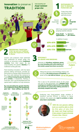
And here, from Euroseeds, is an explanation of how gene editing could save beloved beloved grape varieties from fungal pests without (hopefully) changing their taste or wine-making features. This one is not interactive, though, so download the PDF to see it properly.
And yes, attentive readers will have noticed that both were included in Nibbles yesterday, but I thought they deserved re-upping, as the cool kids say.