- File under “never too late”: Ireland diversifies its potatoes.
- UK establishes livestock breeds committee. Not concerned about species?
- “All I think of is more and more artemesia,” says shilling millionaire Ugandan farmer.
Threatened livestock species?
Many thanks to Michael Kubisch for this contribution.
An interesting recent article in Molecular Ecology asks the provocative question of whether cattle, sheep and goats are endangered species. 1 Yes, that is species, not breeds. While nobody will question the fact that many livestock breeds all over the world are at risk of disappearing, the suggestion that whole species may be at risk would seem far-fetched.
Well, not if you’re a geneticist. The article nicely summarizes what’s been lost in terms of genetic variation and the overwhelming impression one gets is that it’s quite a bit. Even in breeds such as Holstein cattle where animals number in the millions, the effective population size, which is an indicator of the degree of genetic variation, would suggest that such populations tend to be relatively homogeneous. The primary reason for this is, as one might expect, mostly economic necessity. The selection pressure for increasing production of desired commodities has inevitably led to the loss of genetic diversity. What seems to have accelerated this loss is the use of modern technologies such as artificial insemination, which allows for rapid and widespread dispersal of the genetic attributes of relatively few males. And this may just be the beginning. The fact that advances in cloning technology now make it feasible to generate transgenic animals with added, deleted or altered genes means that such changes would by necessity depend on their dispersal on very few founder animals. So it is likely that this trend is not only continuing but may, in fact, be accelerating.
Nibbles: IPRs, chicory, pigs
- Tewolde Berhan Gebre Egziabher optimistic that farmers can avoid becoming “serfs of a different kind”.
- Three chicory museums? Who knew? Want to know more about chicory?
- Just when you thought it was safe, Return of the Pocket Pigs (with added photographic goodness).
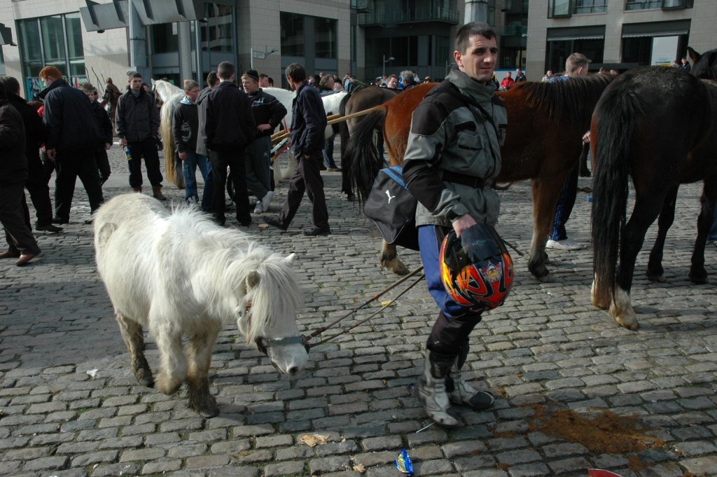
Out and about: Smithfield Horse Market
This just in from our friend and occasional contributor Danny Hunter out and about in Dublin admiring the agricultural biodiversity on show in a local market.
I walked one minute up the road to the Smithfield Horse Market and was surprised at how big a concern it was. There were horses, ponies and donkeys of all sorts. It was chaotic and pretty much unmanaged. Largely run by and catering for the Traveller community. At one stage there was a bare knuckle fist fight between two brothers apparently. If you missed that you could always go to the van selling videos which had a wide range of DVDs of all sorts of family members, friends and foes slugging it out (among the many road races the Travellers organise in various places). Kids as young as 12 years old were buying and selling! While it is always lovely to be around horses and get some nice shots it all seemed a bit brutal and sad. I liked the scene of the guy with crash helmet and shetland pony walking through the market. After a few hours of sweet fresh horse dung I set off on the Luas for the fresh lungs of Bray and did the 10km coast walk to Greystones.
Nibbles: Carnival, pomegranates, cattle, potatoes
- Berry Go Round No. 2 is up with lots and lots of botanical links.
- Pomegranate juice manufacturer says its juice is best.
- Cattle and aurochs did the wild thing.
- The Ontario Ministry of Agriculture, Food and Rural Affairs has a potato genebank. With pic goodness.