The Leverhulme Centre for Integrative Research on Agriculture and Health (www.lcirah.ac.uk) and the University of Aberdeen are embarking on an interesting project for the UK’s Department for International Development.
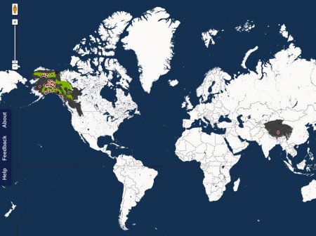
The objective of the project is to map the growing research activity on agricultural interventions to improve nutrition in low-middle income countries and identify “gaps” in current and anticipated research.
You might like to consider contributing information if you are undertaking or planning research with a
focus on an interaction between agriculture and nutrition, such as agricultural interventions to improve nutrition and their evaluation, the influence of agricultural practices and food value chains on nutrition, governance and policy processes through which agriculture and nutrition are linked, and links between agricultural productivity and/or growth and nutrition at a macro scale etc.
The people to contact are Corinna Hawkes (corinnahawkes “at” o2.co.uk) and/or Rachel Turner (rachel.turner “at” lshtm.ac.uk). It could be your research, or research you know about. Or indeed relevant networks (mailing lists, online fora, communities of practice) you participate in.
No doubt someone will eventually mash up the results with all the clever maps now available on HarvestChoice‘s recently revamped website.
The cutting-edge MAPPR, for example, enables users to pick and choose among hundreds of “layers” of map-based information about all aspects of smallholder agriculture in Africa—from poverty to rainfall—and make customized maps and summary tables.
But more on that tomorrow. Stay tuned…
LATER: It occurs to the blogger, belatedly, that “to map” has more than one meaning. Ooops.

