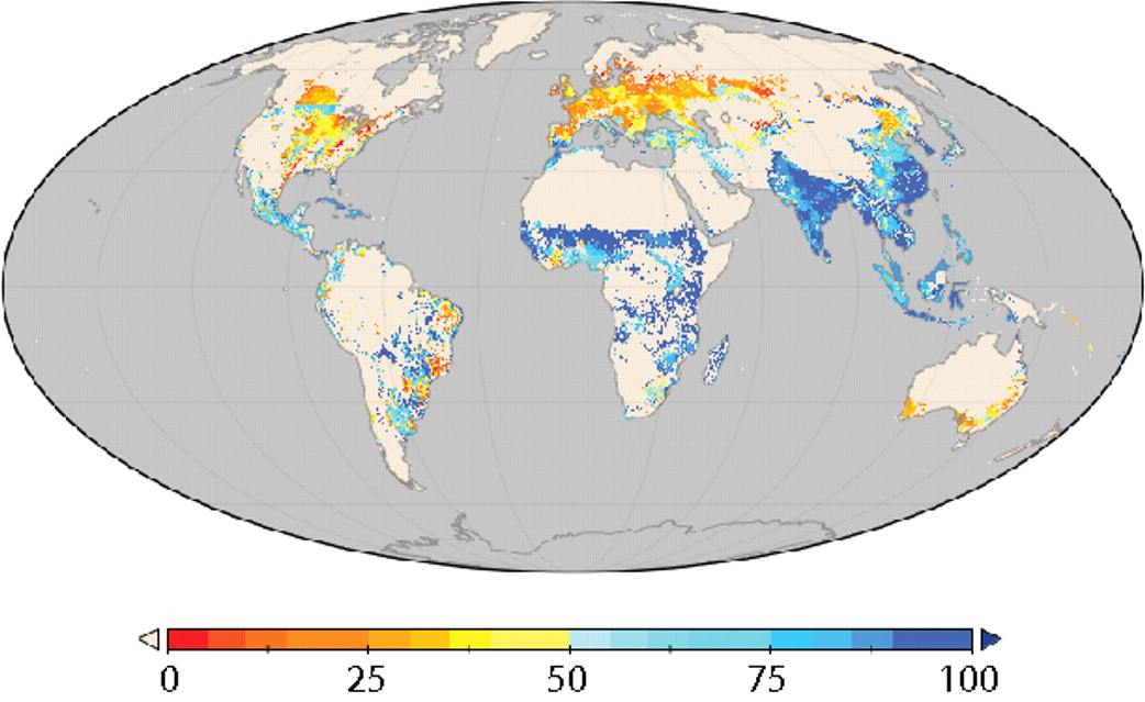
 Our cartography nut is otherwise engaged, temporarily, but I know he’d love this one. Blue shows agricultural production consumed directly by people: food. Orange-red is consumed indirectly in processed products, mostly feed for livestock but also things like cotton and coffee. Notice anything interesting about the distribution? Yeah, me too.
Hat tip to Resilience Science, which gives links to the original study.
The yellows and reds may be even more pronounced as the biofuel fad heats up….What is going on with northeast Brasil and Ivory Coast? That area of Brazil is the poorest in the entire country. And Ivory coast is poor. But they are red and yellow. An error in the data? Or are these areas producing lots of feed and processed food?
I’m not sure, but I suspect that the two cases you mention are growing cacao and, maybe, soy for feed and export.
from wikipedia… http://en.wikipedia.org/wiki/Economy_of_C%C3%B4te_d'Ivoire
“Côte d’Ivoire is among the world’s largest producers and exporters of coffee, cocoa beans, and palm oil.”
Starbucks, chocolate, and biofuels, all in one nonfood package
Rich