Resilience Science points to a new source of cartograms at ShowWorld, a project of Mapping Worlds. These maps, which display a metric by manipulating the sizes of the various countries displayed, are a wonderful way to bring boring old data to life, and an even better way to fill an empty hour or two. What I really want, though, is a way to mash two data sources. Resilience Sciences selects carbon dioxide emissions and pig populations. Great, and just looking at the maps I have a strong impression that there’s no correlation between number of pigs and carbon dioxide emitted. But is that really true? Enquiring minds want to know. Some genius should figure out a way of doing x per y in a cartogram.
Here, though, we have Wine and Cheese, which were meant to go together, and more or less do, which is nice.
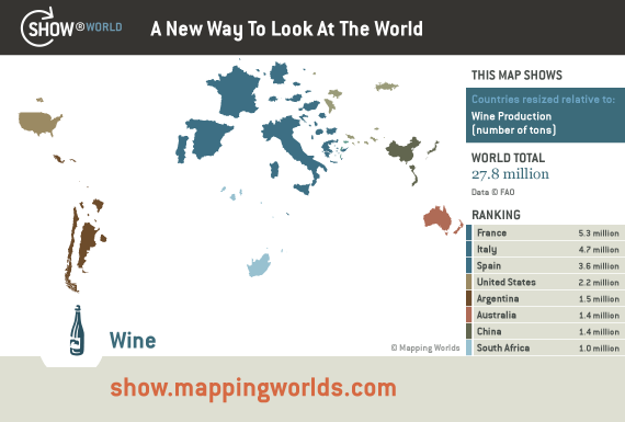
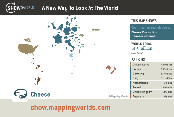
Too bad they’re wine and cheese production and not diversity. But the data — like the truth — must be out there.
Totally spooky! No sooner has Luigi demanded news of cheese diversity than I am able to oblige, thanks to Intelligent Life.
Interesting. I guess France would come out top of any league table of number of different cheeses produced in a country, but I bet that any decent London cheese shop will have a much greater diversity on offer than anywhere in Paris.
Bah! A pox on London. Best Cheese Shop I’ve Ever Been To In The UK. Iain Mellis, Cheesemonger.