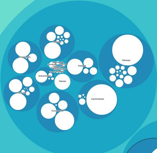
A tweet from Dan Chitwood of the Donald Danforth Plant Science Center really made my day today. He’s written a piece of code which shows production of different crops in 2011 (according to FAOStat) as a very cool infographic where the crops are differently sized circles arranged by botanical family. Here’s a screengrab, but go to the website, and click on a circle and see what happens. I so long to do this for genebank accession numbers…