A big thank you to Fernando Aramburu Merlos, one of the authors of a very interesting recent paper on crop rotation in the USA, for contributing this nice blog post describing his findings.
If a picture is worth a thousand words, a good map is worth a million. Or, at least, that is how it felt after spending many hours staring at CropScape and mapping crop rotations – that is, the sequence in which different crop species are planted in a field – across the United States.
The USDA CropScape database is amazing: it identifies the crop planted for 30m grid cells across all the contiguous United States for the last 10+ years. It is a unique resource to better understand crop species diversity patterns for an entire, large country, and that is what we set out to do. “Let’s download the data and see what we can do,” said my advisor Robert Hijmans some time ago. But having a lot of data can also be overwhelming, and questions abounded. How should we estimate diversity? At what scale? And in what dimension: time or space, or both? In the end, much of the analysis focused on how temporal and spatial diversity are connected.
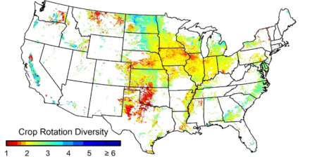
As an agronomist by training, it astonished me how little was available on spatial patterns in temporal diversity. For so many hours I have had to listen to lectures and read about the benefits of crop rotations, but I could not find a single crop rotation diversity map. One reason is surely that you need high spatial resolution crop distribution data for that, which is not available for most countries. So I was thrilled to create the first crop rotation diversity map for the US. I still can’t stop looking at it. Here it is.
The map, and the article that discussed it, has just been published. 1 It shows (to no one’s surprise) that temporal crop species diversity in time is very low in most of the USA. The national average is 2.1 crops, with 86% of the cropland with 3 or fewer crops in rotation. We also found that the greater the popularity 2 of an annual crop, the less diverse is the rotation it is grown in. We proposed various reasons for that, but the take-home message is that “to increase crop species diversity, currently minor crops would have to increase in area at the expense of these major crops.” We would need less maize, soybeans and wheat to make space for other crops (to get back to the peak-diversity of the 1960s).
The scale issue was the hardest to tackle, and it is not just a purely academic concern. A number of recent papers use country level crop diversity data to explain food production stability and pollination . Our analysis suggest that while these country level analyses may be of interest, it is important to note that national level diversity is not directly related to farm level diversity, as many authors seem to assume.
So do read our paper if any of this interests you. And if it does not, you can still simply enjoy the maps.
- Aramburu Merlos, F., and R.J. Hijmans, 2020. The scale dependency of spatial crop species diversity and its relation to temporal diversity. Proceedings of the National Academy of Sciences. If you don’t have a subscription, it will become open access on April 2021. If you can’t wait, please, email me at faramburumerlos at ucdavis.edu and I’ll happily provide a copy.
- Meaning their planted area.

Great effort to compile cropping systems data representing agro diversity