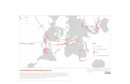
Wouldn’t want you to miss out on this nice find from Jeremy’s last Eat This Newsletter of 2022, just because we’re in a new year now. But why not subscribe, eh? Incidentally, since we’re talking about the movement of crops around the world, and fancy graphics, you might as well also check out Bloomberg’s cool re-visualizations of the data in the 2014 paper “Increasing homogeneity in global food supplies and the implications for food security.”
In the decades after 1492 “a massive multidirectional transfer of biota, diseases, technology and humans occurred between Afro-Eurasia and the Americas”. But if you look at the standard maps of these movements, collectively known as the Columbian Exchange, you miss almost all the complexity and context of what moved, where, why, and what else was going on.
That’s the conclusion of a new paper: (Re)Mapping the Columbian Exchange. Suggestions for an Updated Cartography. The paper itself is behind a paywall, although one of the authors is a friend of the podcast so I may well invite him on to discuss the story in more detail. Thankfully, the maps themselves are available to download, and even a superficial glance shows that the story is much more interesting than the standard maps imply.

Each of them overcomes the “overly constrained geographic scope, chronological compression, non-depiction of the contemporaneous movement of important cultural, technological and biological elements of each product, ethnocentrism and the obscuring of human consequences” of the standard map, and I look forward to reading the new plant biographies just as soon as I get hold of the paper.
Caption to the map of diffusion of sweet potato: “Sweet potato originated in modern-day Peru and Ecuador, and were domesticated from a wild tuber up to one hundred thousand years ago.”
Spot the major error!