- Food security? Can you say Eyjafjallajökull? Well, no, neither can I. But I know a man who can.
- Got something worth saying on GIS in Africa?
- From government intervention to the free market and back again. Neat trick if you can do it.
- Restoring Kabul’s herbarium “will vastly improve Afghan research capacity”.
An early look at an atlas of agrobiodiversity
On reading about the Atlas of Global Conservation here a few days ago, Nora Castaneda of Bioversity International’s Regional Office for the Americas sent me some of her own forays in that area, which are focused on plant species of agricultural interest. They’re still works in progress, and unpublished, 1 but definitely worth having a quick look at. The data comes from germplasm databases (SINGER, GRIN, EURISCO) and the databases put together for the GapAnalysis project, about which we have already blogged about here.
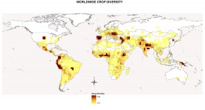
Here’s what the distribution of numbers of accessions of varieties of the major food crops in genebanks looks like. Dark brown means lots of different accessions (not varieties, mind!).

One has to wonder what’s going on in Spain. As I say, it’s a work in progress. A certain amount of data cleaning may still be necessary, for example to identify duplicates and take them out of the equation. And when Genebank Database Hell allows it should even be possible to take into account morphological and genetic diversity.
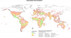
Anyway, here’s the distribution of richness of wild relative and landrace accessions of a number of major crops. Green means lots of species and landraces.

When finished, I think these maps will make a great complement to the Nature Conservancy’s Atlas. But would the biodiversity community be interested?
An Atlas of Global Conservation goes (partially) online
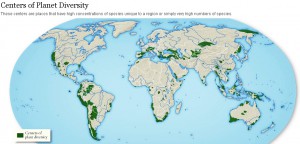
The Nature Conservancy is publishing an Atlas of Global Conservation . 2 Some of the maps are online, though not the one below, which I got from a slideshow over at the Washington Post accompanying an article on the atlas.
Why not, though? Surely, if someone is really going to buy the hardcopy version, they are not going to be put off by the fact that all the maps are on the internet. I left a comment to that effect on the Conservancy’s Facebook post announcing the atlas, and they very kindly got back to me saying that more maps will indeed eventually be made available online.
What’s that you say? Any agriculture? A map of centres of crop diversity to go with the above? The list of data sources is not encouraging. But I could be wrong. I’ll keep you posted.
Nibbles: Asses, Mapping pathogens, Oysters, Tea, Turkish biodiversity hotspot, Dolmades and sage, Yams festival, Pollen video, Agriculture and mitigation, Rarity, School feeding, Sheep
- Jeremy probes into wild asses at Vaviblog.
- Mapping the evolution of pathogens. And in kinda related news…
- The European oyster needs diversity. Well, natch.
- The tree forests of Yunnan, and, concidentally, the story of how the secret of their product got out.
- The Kaçkar Mountains at Yusufeli, northeast Turkey are in trouble. Any crop wild relatives there, among the bears and other charismatic megafauna
- Speaking of Turkey, here’s how to make one of its delicacies. But hey, if you don’t have vine leaves, you can use this.
- Having fun with yams.
- Drori does pollen.
- FAO’s Mitigation of Climate Change in Agriculture (MICCA) Project. Any agrobiodiversity-related stuff? Need to explore…
- “…conserving species may only require specific activities, such as collect and distributing seeds.”
- African school feeding programme uses “local” products. What would Paarlberg say? You can find out here, if you have 90 minutes to spare.
- British boffins breed self-shearing sheep. No, really.
International collections can’t do it by themselves
Two international centres tout their germplasm collections today. AVRDC’s newsletter, which I just got by email but can’t find on their website, gives a bit of a history lesson:
When AVRDC was founded in 1971, the Center started off with a modest collection of 570 accessions. By 1995, the genebank had grown to 43,205 accessions, comprising 63 genera and 209 species. To date, the Center has accumulated 57,230 accessions comprising 168 genera, 420 species from 154 countries of origin, a growth of 32.5% in number of accessions, 166.7% in number of genera, and 101% in number of species. AVRDC’s vegetable germplasm collections, held as an international public good for the world community, are growing in genetic diversity.
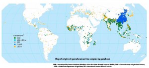
A further snippet of information shows yet again how interconnected the world is for genetic resources. Although “AVRDC is the largest holder of tomato germplasm,” it only includes “9% of the 83,680 accessions held worldwide.”
The same point is made, not quite so directly, but in a more visually striking way, in a map just out in Rice Today (click to enlarge):
And that, dear reader, is why we need a global system, and not just ever more genebanks.

