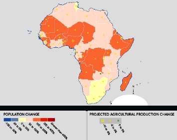
Population Action has an interactive map which mashes up climate change (including its effect on total national agricultural production) with population dynamics. Here, for example, is the result for Africa. 1
The source of the agricultural production data is a 2004 crop modeling study by the Godard Institute for Space Studies distributed by CIESIN. 2 Worth taking the guided tour to start off.
You can’t imagine how many different versions of this sort of map have been on show here in Amman at the conference on food security in the drylands. Somebody ought to do an inventory…
- Sorry about the quality, I can’t see an easy way of downloading a decent image, but the thing looks well enough on the website itself.
- The BBC’s mashup of climate change, population and industrialization seems to use different data, and goes to sub-country level.

Check-out OVERPOPULATIONPHOBIA find out what is all about http://wp.me/pLYez-t