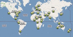
- Jacob alerts me that our “throw duplicates of all accessions from an airplane flying across Africa” Gedanken experiment may be closer to realization than we thought.
- Reindeer in trouble. In other news, there are 7 subspecies of the things.
- Indonesia looks to its threatened livestock wild relatives.
- Agriculture (among other things) in North Korea.
- Buffalo distributed in Myanmar. From where?
- Local vegetables promoted in the Philippines.
- More inspirational stuff on the Millennium Seed Bank from Jonathan Drori.
- Organizations Involved in Organic Plant Breeding Projects and Education. Not as many as you’d think.
- “Learning centres” helping farmers identify challenges, adapt to climate change.
Nibbles: Coca to cacao, BXV, Chinese gardening, Forest conservation, Amazon, Soil bacteria, Prairie, Genetics, Wildcats, Milk product
- “No a la droga, si al caucho y al cacao.”
- Spotting banana Xanthomonas wilt (BXW) with biochemical tests.
- The tree that owns itself. Take that, lawyers!
- “The old Chinese gardener in ragged blue coat and trousers with a wispy white beard who potters around smoking one of these long pipes with a tiny bowl — and a mongol cap, periodically performing elaborate grafting techniques on the plum tree.”
- Mexican coffee growers protect surrounding forest. Nepal forest community moving in similar direction?
- Mapping the competition between soy and forest in Brazil.
- Weird agrobiodiversity corner: pseudomonad bacteria help maize take up nutrients.
- Using herbicides to help prairie establishment (including sunflower wild relative).
- Stop press: “Agricultural genetics is one of the easier parts of the solution.”
- “…wildcats preferred resting sites in shelter structures near forest edges.”
- Video on Greek yogurt. Jeremy comments: “I’m going back to Crete.”
The Human Toll of Climate Change mapped
Science Progress has a great interactive map on the effects of climate change on different aspects of human life, including health and agriculture.

Clicking on the pin takes you to the original source of the information. And you can add your own pins. This is just the kind of model that we could use in developing our platform for an early warning system for genetic erosion.
Location, location, location
Tracing Paper had a fun mosaic of food-themed maps yesterday. We’ve blogged about a couple of them before, and lots more actually, as it’s a bit of an obsession around these parts, but it’s fun to see them all together like that. And while we’re on the subject of geography, I got 8 out of 9 on the beer geography quiz that was also concidentally on Mental Floss this week. Can you beat that?
“Global human sensor net” to be cast for biodiversity
Another attempt to harness the “wisdom of crowds” is in the offing. The eBiosphere informatics challenge is asking people around the world to send in observations of “species of interest.” That basically means mainly invasives and threatened species, for now. You can contribute photographs to Flickr or use Twitter or send an email. You don’t have to be a taxonomist: you’re asked to do your best on the identification, and they’ll bring experts in for confirmation. All the observations coming in will be integrated it with other scientific knowledge (e.g. taxonomy, maps, conservation status) on the species.
Now, if you’re a regular reader you’ll know this kind of approach is one we’ve occasionally contemplated here for crop wild relatives, landraces and other agrobiodiversity, in particular to monitor threats and erosion. So I’ll be watching closely.