- OBIS maps marine organisms. But does it include this data from China?
- Private sector delivers biofortified millet. But will it make it to the wiki for Indian agriculture?
- New paper by APRODEV and PELUM on why CAADP should follow IAASTD. Glossary not included. And more on African agriculture from Gates. Not like this, though.
- Millennium Seed Bank in ecosystem restoration. And a study on ecosystems that are actually going to require less restoration than others.
- Monsanto supports online world flora. What could possibly go wrong? Meanwhile, in the public sector…
- Olivier de Schutter’s recent Right to Food shpiel for IFPRI. LOTS of words. I guess you had to be there.
- Small-scale elk farming primer. Not as crazy as it sounds, but pretty crazy.
- And if you’re a young scientist, from sub-Saharan Africa, and interested in forest genetic resources, well, here’s a fine forestry fellowship opportunity.
- The Bounty Redux. The whole bringing-breadfruit-to-the Caribbean thing seems to be going more smoothly this time.
- Huffington slideshow on the world’s endangered foods.
Mashing up the Global Forest Disturbance Alert System
So here’s how I’d like that Global Forest Disturbance Alert System I blogged about a couple of day ago to work, eventually. Or even this. Or this, for that matter.
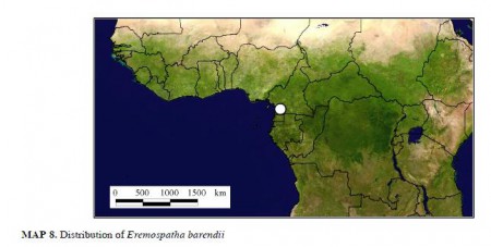
But anyway. Say you’re reading about rattans in West Africa and you get interested in, say, Eremospatha barendii, which is kind of rare and probably perhaps sort of endangered, maybe. So you head on over to GBIF to get a better idea of its geographic distribution, but you come up blank. But then you do some more digging and you realize that there’s a new taxonomic revision, describing in minute detail the morphology and ecology of all the African species, with nice drawings and lists of specimens and identification keys. 1 And, by golly, it has pretty maps too.
Pretty, but unusable. The damn things are in a PDF, not the nice Google Earth files you would have got from GBIF. But the coordinates of all the specimens 2 are given in the text, so you extract them from the PDF and plonk them into Google Maps. It’s the little green arrow in southern Cameroon shown below.
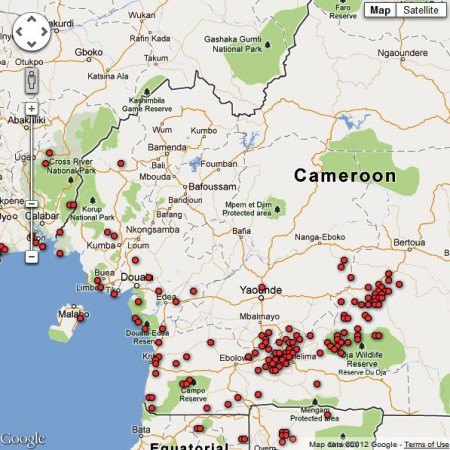
But you also want to know to what extent that area is threatened. So you head on over to the Global Forest Disturbance Alert System and you look at the latest data on where there is forest disturbance happening in Cameroon, which are the little red dots here.
Now you can see if that population of yours is perhaps threatened. Well no, you can’t do that now, not easily, because there’s no way to export the little red dots to Google Maps, or import the little green arrow into the Global Forest Disturbance Alert System. But I’m sure you will be able to do that one day. And then you could actually visit 3.066667 N 10.716667 E, and check out that Eremospatha barendii population, assuming it is still there, what with you spending so long mashing up the data and all, and also ground-truth any disturbance that the Global Forest Disturbance Alert System might have, er, alerted you to; maybe even describe its causes. And annotate the little green arrow and the little red dots with your observations.
Wouldn’t that be nice?
Nibbles: Maize genome, Mapping plants in the US, Sixth extinction, Finding species, Korean dog, IUCN guidelines, Ginkgo evolution, Churro sheep, Malaysian trees, Nutrition training
- Maize diversity sliced and diced to within an inch of its life.
- Mapping invasives sometimes = mapping crop wild relatives. Compare and contrast.
- Red List hits 20,000 species.
- And yet we keep finding new ones, even in Europe.
- Reconstructing a Korean dog breed.
- You too can help IUCN with its genebank guidelines.
- Video history of ginkgos. “Are we watching them as they evolve, or are they watching us?”
- Video history of Navajo sheep. Touching.
- Malaysian forest tree genebank at work. Any ginkgos in it?
- Hurry! You have 2 days to apply for a Training course on Food Systems: From Agronomy to Human Health, in Benin.
Agricultural biodiversity and population in Laos
Normally, I would elegantly link some trenchant comments on the Agrobiodiversity Initiative in the Lao PDR (TABI), whose website has recently been pointed out to us, 3 to the equally recent release of the AsiaPop dataset. But Lao PDR is, annoyingly, not (yet?) one of the countries for which AsiaPop has spatial population data. Which is a pity because TABI does have some interesting-looking maps on its study sites as well as a rather more forbidding, though no doubt extremely useful, online metadata platform.
Failing that, I’ll just leave you with TABI’s own description of TABI:
TABI is a long term commitment by the Lao Government and the Swiss Agency for Development and Cooperation (SDC) which seeks to conserve, enhance and manage the biological diversity found in farming landscapes in order to improve the livelihoods of upland farm families in northern Laos. During its first phase (2009-2012) TABI is geographically focusing on Luang Prabang and Xieng Khouang Provinces in the north of Laos.
Global system for monitoring vegetation disturbance launched
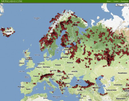
The redoubtable Mongabay.com has just announced the beta version of the Global Forest Disturbance Alert System (GloF-DAS). How it works is that four times a year (at the end of March, June, September and December) the CASA ecosystem modeling team at the NASA Ames Research Center produce something called the “Quarterly Indicator of Cover Change” (QUICC). This compares global vegetation index images from NASA’s Moderate Resolution Imaging Spectroradiometer (MODIS) from exactly a year before with the ones they just got. GloF-DAS then takes the QUICC data and maps the location of forest disturbance as the center points of 5×5 km areas where there was a >40% loss of forest greenness cover over the previous 12 months.
Here’s the result for Europe, for the year period ending March 2012.
There’s some issue I’d take with this approach. Most importantly, comparing March with March is not necessarily comparing vegetation at the same level of seasonal development in the temperate zone. But I think this is a great step forward in developing a global system for monitoring threats of genetic erosion. As the developers point out:
The cause(s) of any forest disturbance point detected in this map has yet to be confirmed.
Disturbance locations and impacts are subject to verification through local observations.
So imagine a next iteration of the system where local observers can annotate some of those potential disturbance points. A bit like what happens in the National Phenology Network in the USA, though for a different purpose. 4 And information will flow out more freely too.
In coming months, GloF-DAS will offer an alert system whereby users can sign up to get notifications via email or SMS text message on recent changes in forest cover for a specified location or country.
Of course, for this to be truly a game-changer we who are interested in monitoring threats to crop wild relatives, say, would need the ability to combine the potential threat data of GloF-DAS with our own data on species occurrence or diversity. It doesn’t look to me like that’s possible just now, but perhaps it is something that we as a community can suggest to the developers.


