- Participate!
- In plant breeding, that is.
- And seed systems too, natch.
- And you too could come up with the world’s hottest pepper.
- Or help save a heritage breed.
- Or sustainably harvest Himalayan nettle.
- But careful not to get high on this chocolate hack.
- Though binging on avocado is perfectly acceptable.
- And for goodness’ sake, watch out for those Russians.
Brainfood: CWR use, Mainstreaming, Duplicates, Phaseolus model, Cherimoya diversity, Legume mixtures, ICRISAT pearl millet, Taste breeding, Rhubarb rhubarb, Plasticity, Seed dispersal
- The Use of Crop Wild Relatives in Maize and Sunflower Breeding. In maize, unlike sunflower, it just hasn’t been worth it. Yet.
- Securing sustainable and nutritious food systems through mainstreaming agricultural biodiversity: an interdisciplinary study. What works in Brazil won’t necessarily fly in India.
- Duplication assessments in Brassica vegetable accessions. Half of 13 accession pairs/triplets with identical names from VIR and NordGen turned out to be morphologically identical.
- Beans (Phaseolus ssp.) as a Model for Understanding Crop Evolution. 7 independent domestication “events” spread across 5 species and 2 continents makes for some interesting natural experiments.
- A Mesoamerican origin of cherimoya (Annona cherimola Mill.). Implications for the conservation of plant genetic resources. Compare and contrast with above.
- Highly productive forage legume stands show no positive biodiversity effect on yield and N2-fixation. Sometimes diversity doesn’t add much.
- Genetic Resources of Pearl Millet: Status and Utilization. 22,888 accessions from 51 countries. Indian landraces: earliness, high tillering, high harvest index and local adaptation; African: bigger panicles, large seed size, and disease resistance.
- Use of natural diversity and biotechnology to increase the quality and nutritional content of tomato and grape. Both are needed.
- Rhubarb (Rheum species): the role of Edinburgh in its cultivation and development. From China, via Russia, with love.
- Will phenotypic plasticity affecting flowering phenology keep pace with climate change? If the change is smaller than about 13 days.
- Seed dispersers help plants to escape global warming. Because they move seed >35 m per decade uphill.
New CGIAR portfolio off and running
CGIAR launched its new portfolio yesterday, there was a Twitter chat thing, and I wrote a blog post about the Genebanks Platform. Not many people hurt.
How genetic improvement and crop intensification improve wellbeing
Mapping crops: Are we there yet?
I ran across a bunch of nice crop maps on the internet 1, so I made a GIF for you (click on it to get it cycling).
You’re welcome.
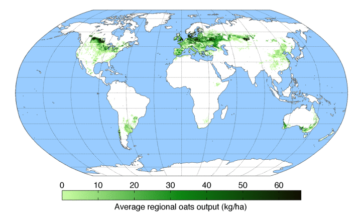
I’m reliably informed the source is Monfreda et al. (2008). You can download the data in multiple formats, but I don’t think I’ve ever seen the headline maps displayed all together as The Decolonial Atlas has done, albeit without attribution, which is naughty.
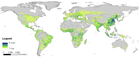
Anyway, people have obviously taken the trouble to download and play around with the data. For example, they have been ably mashed up by Bioversity to get a global crop diversity map.
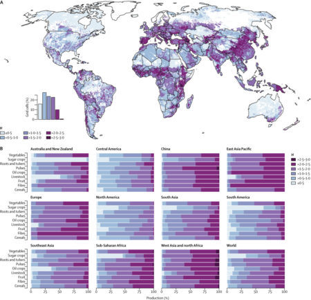
Which, in turn, it is instructive to compare with the one from the Lancet Planetary Health map we blogged about a few days ago.
But which dataset to use to do this kind of stuff? Monfreda’s is only one of many.
I see that we now, after a long wait, have WordClim 2, thanks to the work of our friend Robert Hijmans and his colleagues. 2 Is it too much to hope for that he’ll now turn his hand to producing the definitive crop distribution dataset? 3 Maybe something for the CGIAR’s Big Data Platform, just launched, to think about organizing, convening, and/or inspiring.
Brainfood: Canola model, Saline dates, High rice, Perennial wheat, European cowpea, Mesoamerican oil palm, Seed viability, Citrus identity, Poor cassava, Horse domestication, Wild tomatoes, Tea genome, Veggie breeding, Classical brassicas
- Development of a Statistical Crop Model to Explain the Relationship between Seed Yield and Phenotypic Diversity within the Brassica napus Genepool. Look for primary raceme area.
- Screening of Date Palm (Phoenix dactylifera L.) Cultivars for Salinity Tolerance. In Oman, Manoma and Umsila are particularly tolerant.
- Genetic structure and isolation by altitude in rice landraces of Yunnan, China revealed by nucleotide and microsatellite marker polymorphisms. Geneflow is horizontal, adaptation vertical.
- Breeding Perennial Grain Crops Based on Wheat. By adding a wild genome.
- European cowpea landraces for a more sustainable agriculture system and novel foods. 24 of them, no less. But you have to start somewhere, I suppose.
- Genetic diversity of Elaeis oleifera (HBK) Cortes populations using cross species SSRs: implication’s for germplasm utilization and conservation. From 532 palms in 19 populations to 34 individuals.
- Large-Scale Screening of Intact Tomato Seeds for Viability Using Near Infrared Reflectance Spectroscopy (NIRS). Good-bye germination tests?
- Genetic identification of ‘Limau Kacang’ (Citrus sp.), a local mandarin cultivated in West Sumatra by sequence-related amplified polymorphism (SRAP). It’s a ponkan.
- Cassava haplotype map highlights fixation of deleterious mutations during clonal propagation. Cassava is decaying genetically, but breeders are helping.
- Ancient genomic changes associated with domestication of the horse. The ancient DNA of immediate post-domestication horses suggests that the stallion bottleneck happened later.
- Genetic Diversity and Population Structure of Two Tomato Species from the Galapagos Islands. They mirror island formation.
- The Tea Tree Genome Provides Insights into Tea Flavor and Independent Evolution of Caffeine Biosynthesis. It evolved caffeine independently of coffee but not cacao. And flavour is down to a whole genome duplication.
- The contribution of international vegetable breeding to private seed companies in India. It can still make one, but for traits rather than varieties.
- Domestication, diversity and use of Brassica oleracea L., based on ancient Greek and Latin texts. Their use as a hangover cure has a long and august pedigree. No word on their raceme area.