- Mike Jackson wants to know how many crop varieties you can name. Please tell him. My number is 42.
- This is what CRISPR looks like. In an infographic, that is.
- Japan’s rice terraces were better for biodiversity when they were, you know, full of rice.
- A Wendell Berry biopic?
- Yep, more on eating insects. It’s definitely a thing now.
Nibbles: Craft beer, Citizen breeding, Botanical e-book, Horticultural bio-piracy, Pollinator reports, Rainforest Alliance map, Italian phytotron, YAP portfolio
- Peak hops? Say it ain’t so.
- Day-long plant-breeding-for-the-masses course at Oxford in April.
- Botanists of the twenty-first century: Roles, challenges and opportunities. An e-book for the ages.
- Genes to beans: polyploidy on a plate. A Royal Society lecture by Kathy Willis.
- Some naughty people have been collecting plants in India without permits.
- IPBES tells it like it is on pollinators. In a press release. You try to find the actual report online. Oh and here’s FAO getting in on the act. Though at least for this the report is easy to find.
- Great interactive map of the work of the Rainforest Alliance. Check out the agriculture tab.
- Italian researchers build a time machine. A phytotron, really, but let them have their little fun.
- Speaking of fun, GCARD3 Youth Agripreneurs Projects on “Climate Resilient Indian Cattle” and “fake seeds.” Lots more too, all interesting.
More access to the data on the Access to Seeds Index needed?
I took Jeremy’s advice and have been doing some digging around the excellent Access to Seeds Index website. So have a lot of other people, of course, to extract what’s relevant to their own particular obsession, 1 whether that be women farmers or small seed companies in Uganda or the informal seed sector. 2
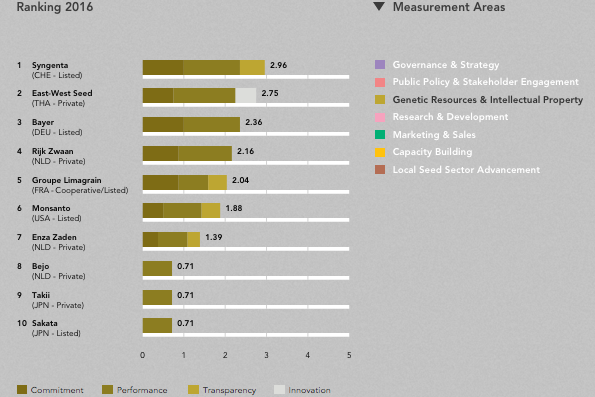
Our hobbyhorse here is agricultural biodiversity, of course, and thankfully one of the measurement areas addressed by the Index “seeks to capture how companies handle genetic resources and IP in ways that support the opportunities for smallholder farmer development.” The Index is calculated separately (for this and a further 6 measurement areas) for field crops, vegetables and companies active in East Africa. Here’s the ranking for the Genetic Resources & Intellectual Property measurement area as far as vegetables are concerned.
There are brief text summaries to go along with this ranking, as well as those for field crops and East Africa, but you have to do some jumping around on the website to get them, so I’ve taken the liberty of pooling them all together below:
Syngenta is the only company with a formal commitment not to pursue or enforce patents and applications in seeds or biotechnology in least-developed countries for private use by subsistence farmers. Companies provide access to their genetic resources. Monsanto, DuPont Pioneer, Dow AgroSciences and Bayer all collaborate with local partners to provide access to specific genetic material or biotechnology traits. This ranges from research on insect-resistant Bt cowpea and water-efficient maize. Support for public gene banks, important for the conservation and use of region-specific crop diversity, is common among global seed companies. But support for local gene banks in Index countries is largely overlooked. An exception for field crops is KWS, which supports public gene banks in Peru and Ethiopia… An exception among vegetable seed companies is East-West Seed, which supports gene banks in Indonesia and Thailand… Whereas global companies have formal commitments in place, most actual activities for the conservation and use of genetic diversity are found among regional companies. East African Seed, Kenya Seed Company and Seed Co, among others, partner with multiple local seed banks and global research institutes. NASECO and Kenya Seed Company also donate their germplasm to public research partners.
You have to refer to the appropriate bit of the methodology to fully understand all that, which means p. 54 of a 70-plus page report.
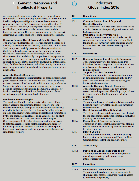
Unfortunately the methodology write-up is not much help unpacking that “[s]upport for public gene banks … is common among global seed companies,” which I found a bit problematic. The relevant bit of the methodology says:
C.II.2 Support for Public Gene Banks. The company supports– through monetary and/or in-kind contributions — public gene banks and/or global funds and initiatives serving public gene banks in Index countries.
I have a feeling this refers to international public genebanks, rather than national ones, but frankly either way I find it difficult to conceive how this could be described as “common” among seed companies. One wonders if the raw data will be made available for others to make their own determinations. Some objections are already surfacing, including this one from Oxfam quoted in The Guardian:
The EU and other countries have signed the international treaty on plant genetic resources for food and agriculture. It would be interesting if the index would in future score how companies comply with this treaty.
Although, to be fair, one way that companies contribute to the Treaty is in fact already covered by the Index
C.II.7 Benefit Sharing. The company contributes to the Benefit-sharing Fund created by the International Treaty on Plant Genetic Resources for Food and Agriculture.
I would certainly love to see the raw data that went into calculating C.II.7 (and C.II.2 for that matter), as I cannot find anything on the website of the Treaty’s Benefit-Sharing Fund resembling a summary of the contributions made by companies.
Nibbles: Banana trouble, Celebrating Ethiopia, Potato nutrition, Kenyan veggies, Coffee history, Twitty book, Biodiversity loss vid
- The musapocalypse gets an infographic.
- Celebrating agricultural biodiversity in Ethiopia.
- High calcium potato wild relatives in the news. No, really.
- NY Times catches up with the Kenyan leafy green revolution.
- The world’s prettiest (only?) coffee genealogy poster.
- The great Michael Twitty’s long-awaited book on African-American foodways is out.
- Nice video on biodiversity loss actually opens with Svalbard Global Seed Vault.
Brainfood: PVP in Africa, Tomato disease resistance, Open source seeds, Barley protein, Improving roots, Bambara groundnut, Indian kodo millet, Cacao diversity, Washington heirloom beans, Mato Grosso cassava, Balanites biotech, Intensive Europe
- Opportunities and Threats to Harmonisation of Plant Breeders’ Rights in Africa: ARIPO and SADC. While the intention of ARIPO and SADC is to create a single internal market for protected varieties in Africa, “the end result may look quite differently.”
- Evaluation of Resistance to Ralstonia solanacearum in Tomato Genetic Resources at Seedling Stage. Out of 285 varieties from 21 countries in the Korean genebank, 4 may be resistant to bacterial wilt.
- Following the Open-Source Trail Outside the Digital World: The Case of Open-Source Seeds. “…by not rejecting the idea of property, including intellectual property, but rather attempting to manage it differently, it creates its own enclosures.”
- Grain protein concentration and harvestable protein under future climate conditions. A study of 108 spring barley accessions. Higher CO2 and temperatures lead to higher protein concentrations but lower yields, so lower harvestable protein. The good news is that there’s variation in the response of varieties.
- How can we harness quantitative genetic variation in crop root systems for agricultural improvement? Apparently we still don’t have a mechanistic understanding of root growth, and we’ll need it if we’re going to improve function.
- Bambara Groundnut for Food Security in the Changing African Climate. It’s nutritious, it’s drought tolerant, and it can be intercropped. What’s not to like?
- Neutral and functional marker based genetic diversity in kodo millet (Paspalum scrobiculatum L.). Indian material falls into 4 groups, with Bihar being very diverse. African genepool and wild species should be useful in broadening base in India.
- Origin, Dispersal, and Current Global Distribution of Cacao Genetic Diversity. We’ve come to the limit of the usefulness of the Pound Collection.
- Exploring the role of local heirloom germplasm in expanding western Washington dry bean production. 24 bean varieties have been grown in the area for 20–130 years, representing a useful starting point for participatory plant breeding.
- Growing Cassava (Manihot esculenta) in Mato Grosso, Brazil: Genetic Diversity Conservation in Small–Scale Agriculture. Lots of diversity within communities, and differences among communities. Varieties with same name not necessarily genetically similar.
- Establishment of an in vitro propagation and transformation system of Balanites aegyptiaca. So?
- Mapping cropland-use intensity across Europe using MODIS NDVI time series. Four indicators show highest cropping intensity in Germany, Poland, and the eastern European Black Earth regions, and lowest in eastern Europe outside the Black Earth region. Interesting to mash this up with agricultural biodiversity? Like earthworms?