Jeff Horwich has an interesting post over at HarvestChoice Labs looking at the effect of the tsunami on agriculture in northern Japan. He used the Droppr tool, which combines Google Maps with lots of other data, in this particular case the world-wide crop distribution data from the Spatial Production Allocation Model (SPAM). In SPAM
…tabular crop production statistics are blended judiciously with an array of other secondary data to assess the production of specific crops within individual ‘pixels’ – typically 25–100 square kilometers in size. The information utilized includes crop production statistics, farming system characteristics, satellite-derived land cover data, biophysical crop suitability assessments, and population density.
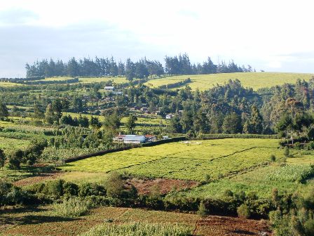
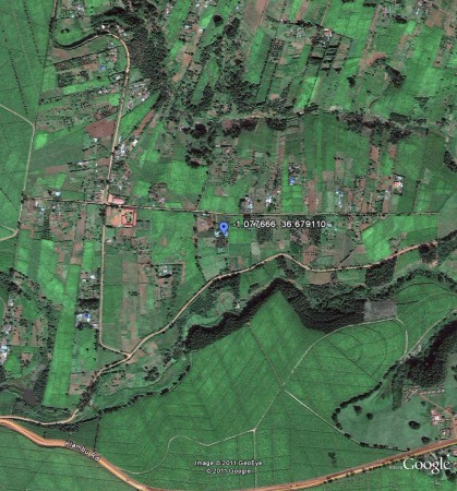
Intrigued, I decided to do a little lighthearted ground-truthing of the SPAM data. I only looked at one location, I admit, but what I found was a bit disappointing. I zoomed in on the location of the mother-in-law’s farm in the Limuru highlands (-1° 4′ 39.60″, +36° 40′ 44.80″). Here’s what the place looks like.

This is the view from space, courtesy of Google Earth. 1
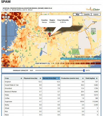
Now, according to the SPAM methodology that’s a cropping intensity of 0.59%, with the main crops being sorghum, sweet potato/yam, groundnut, banana/plantain, potato, coffee and sugarcane.
Jeff very niftily embedded both a map and a spreadsheet of the production data for the main crops in his post, but I wasn’t able to work out how to do that. So you’ll have to make do with this wholly inadequate screengrab, I’m afraid.
What my mother-in-law and her neighbours actually grow is maize, beans, potato and tea, tea and tea. A pretty different set of agrobiodiversity to what SPAM thinks. And I think she would be surprised at the low value of cropping intensity. This is a very high-potential area.
Anyway, that’s only one data point. It would be interesting to know from the SPAM guys if there’s a more systematic attempt going on to check on, and refine, the results of the model.


Lighthearted? Hmmmmm….. SPAM is for broad scale analysis. It is like what Churchill said about democracy, god-awful, but much better than anything else. Not fully true since there are other efforts out there (the McGill group). Unfortunately, I dont think serious funding has been given to this type of effort. IFPRI has done wonders given the enormity of the task.
Yeah, very lighthearted, dude. Of course it’s great stuff. But people should be aware of possible deficiencies, and how to get around them. One thing though. And I may have mentioned it before. If such tools are truly meant to be used by researchers and policy-makers to draw up plans and make decisions, there are going to have to be better exporting and importing options.
This is a great tool to refine SPAM!
What? Crowdsourcing?
Let’s make an app.
No embedding — just a screen-grab! There might be a handier way to do it, but I’m relatively new here :-)
Thanks for this post. I’m hoping one of our SPAM experts will jump in (I most certainly do *not* qualify on that count). Undoubtedly two factors are the pixel size, and the age of the data. I can tell you that the SPAM data has a major update in-progress, and it’s likely an older release that’s feeding the Droppr tool at the moment.
Now, if I could only get pixel data down the level of a specific Sendai seashore greenhouse… then I could really answer my question!
Very good to have an active debate on this subject at it raises both SPAM-specific and more general questions about assessing the “fitness-for-purpose” of spatial datasets. Dealing first of all with fitness for purpose issue, it’s clear that we who generate and offer up spatial data are doing a very poor job on at least two counts; explaining to potential users the purpose and range of applicability of our data, and providing some assessment (quantitative or otherwise) of data reliability for the stated purpose. As a “Community of Practice” we can and should be doing much better on that score.
Specifically with regard to SPAM we can again think about two general reasons for badly-fitting results. First, our goal in SPAM is to provide a “plausible” assessment of the distribution and performance of crops that best matches available evidence from a number of sources (sub-national crop statistics, satellite imagery, spatial patterns of the suitability of climate and soils to support the growth of different crops, rural population density, and so on). At best, our assessments are totals (area, production) or averages (yields) of production across a 10km by 10km pixel (100km2) tract of land, so it’s always tricky to compare our results to conditions on the ground at specific locations. The second, and more likely culprits are the input data sources and methods we use to generate our SPAM maps. Some practical problems include unreliable sub-national agricultural statistics, variable quality of cropland detection from satellite imagery (I’ll check what land cover category our input data had assigned to Luigi’s MIL’s spread – obviously cropland in the image). Common challenges we run into are, for example, that sub-national statistics report crops as being grown, but the land cover data reports no cropland. Another is that our crop suitability “rules” suggest it’s impossible to grow a certain crop in an area but it actually is grown, and so on. So, yes, much that can be improved – but I take comfort in Glenn’s Churchillian analogy to democracy.
But back to Luigi’s parting shot and key question. What steps are we taking to improve the reliability of this data? Actually quite a few. Not all of which bear fruit in the short term. First, we are committed to exposing not only our results but also our input data and providing a range of tools to promote user-lead error-checking and diagnosis over the web (yes, crowd-sourcing). Second, we are improving diagnostic and validation methods and tools to pick up and deal with inconsistencies as we process the multiple data sources. And third we are engaging more directly with networks and fora of crop-specific and regional experts to elicit feedback directly. In this context we have recently held cassava, potato, and sweet potato “mapping parties”, and my colleague Jawoo Koo leaves this evening to India to join the Global Maize Program meeting of CIMMYT to elicit more collaboration and guidance from experts gathered there on improving the maize map for our mutal benefit.
If we could only get another 5,000,000 Luigi’s to send back information like this from all around the world we’d be in clover! (or maybe maize?)
Thanks, Stanley. I appreciate you taking the time to respond. But you don’t need 5,000,000 Luigi’s. Give me a couple of round-the-world tickets and a few months and I’ll get you some more ground truth.
Anyway, interesting to hear about the crop-based validation exercises. What about banana, though. Surely there’s a lot happening there?
I really appreciate all the efforts around SPAM and think they are more than necessary to get this going. However, while a useful start, the “mapping parties” or funding Luigi’s trips and similar ways of data gathering are difficult to sustain in the long term. Also, I think it would be important to have something in place that allows to detect abrupt landuse changes, such as those provoked by “land grabs”.
In summary, the big question would be: how can we generate a constant stream of information from the field to monitor global land use change in a cost-effective way?
Could there be more light-weight methods, based on crowdsourcing?
Can we involve the people on the ground: agriculture students, Peace Corps volunteers, etc.?