Using MAPPR, a policymaker can identify regions of a country with high concentrations of both poverty and cropland, or an investor thinking about building a food-processing plant can search for locations that combine production of sufficient quantities of a particular crop with good access to markets.
Well that sounds like fun. I’m an investor. I’m thinking of ploughing my hard-earned cash into a cassava processing plant in Tanzania. Let’s see if MAPPR can help me.
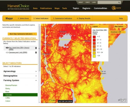
You can indeed produce a map of both cassava production and average travel time for Tanzania, and fairly easily. Here’s what you get for “Median travel time to human settlement of 20,000 or greater population”, for example.
You can also very easily produce a map of cassava yield, production and area in Tanzania. You do that by clicking on the little eye thingie on the left of the map, where is says “Cassava Prod. (mt) (2000).” Problem is, when you do that, your map of travel time disappears, and I can see no way of showing the two together to tell me where short travel time to a village coincides with high cassava production, assuming that’s a sensible thing to want to know. Short of printing out the two maps on transparent paper and looking through the two of them on a light table, that is. Gosh, I used to do that back in the 80s. Ah, but you can’t even print the maps out easily. You have to do the screen capture thing. As an investor, I’ve already given up on MAPPR.
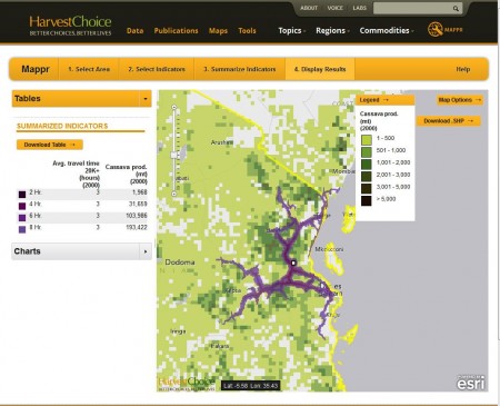
But I’m not an investor, I’m a sucker for punishment, so I persevere. Maybe this “Summarize indicators” option will help me. Well, it does, thankfully. You can pick a specific location, or define a custom area, or a domain (an agroecological zone, say), and MAPPR will give you summary information for both travel time and cassava production. So, for example, this is the result of combining “Median travel time to human settlement of 20,000 or greater population” and “Cassava Prod. (mt) (2000)” for a specific location I chose at random.
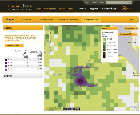
Perhaps somewhat more helpfully to our imaginary investor, you can also get a map of travel time to a specific location, and cassava production within different travel times of that location.
Unfortunately, sharing this result is problematic. Basically the only thing you can do is a screen grab. Trying to export the shapefile so you can use the map in your own GIS, and maybe do further analysis, or combine it with your own data (cassava accessions in genebanks, anyone?), or even produce a nice image, results in the dreaded “404 – File or directory not found. The resource you are looking for might have been removed, had its name changed, or is temporarily unavailable.” And if you try to go back to your result, MAPPR flings you back to the beginning and you have to start the whole process over again. Ouch.
So actually, if you are “an investor thinking about building a food-processing plant can search for locations that combine production of sufficient quantities of a particular crop with good access to markets” I think you will find MAPPR pretty useless. You’d have to have a number of a priori options for siting your plant, and then you could go through all of the above for each of those sites, and then maybe by comparing the results pick your best bet. But you wouldn’t be able to work out where the very best place to site your plant in the whole of Tanzania might be. And you wouldn’t be able to export your results and do your own analysis based on the data that is available.
And even if you could, because let’s say I’ve missed something in the functionality, you wouldn’t be able to share your results in a way that lets others explore them further.
But don’t take my word for it. You be that policymaker in the blurb that wants to “identify regions of a country with high concentrations of both poverty and cropland.” If you can do that, I promise to host the results here. And apologize to the MAPPR team. Until then, I maintain that this is not a tool that the average policymaker or investor is going to use, at least more than once. And neither will I. Believe it or not, I’m really sorry about that.


Have you contacted Stan Wood or Jawoo Koo or any of the MAPPR team with these HI issues?
Chris
I have left a comment on the IFPRI post quoted here. I have not contacted anyone at MAPPR directly. What is HI?
Luigi, Thanks for a very helpful posting in terms of sharpening our focus on potential MAPPR improvements. That rather long pipeline already includes alleviating some of the frustrations you encountered, particularly the inability to download user-created maps in addition to the table and chart download options. As shown on your screenshots of the Market Shed summary tool it is already possible to download the map in GIS format (the button with the – admittedly arcane – inscription “Download .SHP”), but that feature is indeed absent in the other summary options. What you (and others) have highlighted is also the lack of an option to download the map you created map in a cleanly annotated .png or similar format to put directly into a report or presentation. I think we maybe a month away from adding that capability.
We will follow up with our way more technical folks on the likely causes of the dreaded “404” and see what that issue might be. I also don’t know what HI is, but I’m sure Chris can enlighten us. We will soon be adding server memory to enhance performance which might be a fix if it proves to be a capacity issue.
On the final comment about poverty and cropland, I went into MAPPR myself and made a map and table in less than a minute highlighting their coincidence at a district level in Tanzania. I saved the map and downloaded the table (and just as you did I had to grab the map with Print Screen for the time being). Such is my own limited technical capacity the only way I knew how to make them available here is via Box;
https://hc.box.com/s/3ad4476cc5f1bcaa69cc
https://hc.box.com/s/12c15230a5de83bcb6dd
I hope that works!
Are some aspects of MAPPR both limiting and a bit kludgy? Indeed so. But feedback like yours and that of other users, in addition to our own pipeline of fixes and enhancements, can only serve to make it better. Indeed, since you’re an investor, we welcome your investment in our data and tools to speed up those improvements!
Meanwhile, please keep the feedback coming.