Always happens this way. No sooner do I find something interesting, that something similar turns up. Case in point my post last week on the Seedlot Selection Tool. It was just a few hours after I happened across the SST that I ran into NBPGR’s PGR-Clim. Ok, it’s not quite the same thing, but almost.
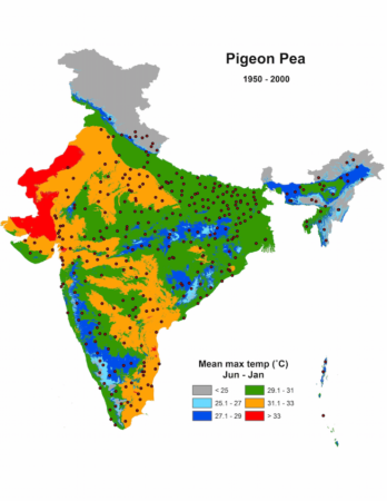
PGR-Clim maps out the Indian genebank’s holdings of chickpea, pearl millet, pigeonpea, sorghum and wheat on a background of rainfall and temperature now, in the 2020s and in the 2040s.
For example, here’s what the pigeonpea collection looks like relative to todays’s temperatures.
And this is relative to the temperature in the 2040s.
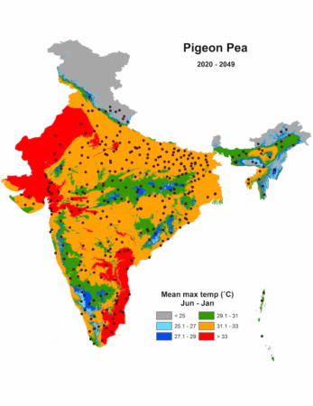
So it is possible now to find a pigeonpea accession with the sort of climatic (or soil) adaptation you need, and request it from NBPGR. All you need to do is locate it on one of these images (which you can download), then somehow remember where it is and find it again on the interactive map that PGR-Clim also provides, separately. If you then click on it there, you get an accession number, which you can cut and paste into the search box of PGR Portal. Hey presto!
 Call me a dinosaur, but I like this sort of stuff. A proper printable catalogue of all the material in a collection, with photographs and all, in this case the