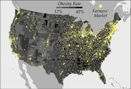
So there I was Scooping away, and what should turn up among the stuff I follow, and almost side by side on the screen to boot? Well, this map of obesity rates and farmer markets in the USA:
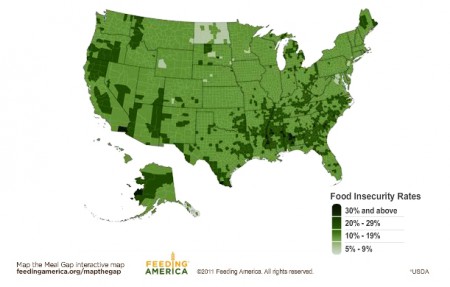
And, I kid you not, this map of food insecurity in, you guessed it, the USA.
Eyeballing does suggest a certain association between obesity and food insecurity, doesn’t it? Talk about the double burden of malnutrition. Oh the fun one could have mixing and matching such maps, and the no doubt dozens of others that also exist out there, documenting the geographic distribution of McDonald’s, organic farms, drunkenness, gyms, pet ownership, house prices, fizzy drink consumption, weed busts…


One Reply to “Mapping America”