I’ve been holding off taking a proper test drive of CCAFS’s new dream machine, Climate Analogues, despite all the media attention, because I heard that the boys and girls in the pits at CIAT were still tightening the cylinder head bolts and optimizing the valve timing. But now it seems they’re done fiddling, at least for now, and I’m going to take it out for a spin.
It’s a simple idea. If you want to help a farming community adapt to climate change, you need to have some idea of what their climate is going to look like down the line. In terms of agrobiodiversity, for example, it would be nice to know of places which right now have a climate like your site will have in 2030, or whatever date, because that’s where you’d look for crop varieties with the climatic adaptations they’re going to need. That is the guts of Climate Analogues. You can of course fiddle with emission scenarios, climate models, length of growing season, whether to deal with temperature and/or rainfall, and dissimilarity thresholds (how dissimilar do two places have to be to really matter?), and the manual takes you through all those options in detail, but what it basically does is compare the climate of a reference site, now and in the future, to the climate of all other places on earth, now and in the future. 1
Easy enough to say, and extremely worthy, but clearly technically complex. That hasn’t stopped these guys before, though. Alas, the implementation in this case is not perhaps as elegant as one has come to expect. It’s still in beta, of course, so things are hopefully going to improve, but I’m sorry to have to report that I did not have an altogether smooth user experience.
Let’s get the little things out of the way first. Like if you don’t know that the default base map is called “Streets” it is a somewhat annoying process to get back to it. Like if you produce a pdf of your results you can’t then get back to your interactive map where you left it, unless you remember to open the said pdf in a separate tab. Like in the results pdf the legend of the map is totally different to the one you’ve just struggled to get to grips with in the online version. Like the fact that in that online map legend red means high dissimilarity, where really what I for one would want to highlight is low dissimilarity, or high similarity, between sites. Like the fact that the place where you change probably the most crucial thing, unless you’re a total climate geek, which is the direction of comparison (now with now, or future with now, or now with future), is buried in a menu called “Additional parameters.” Like the fact that it’s not entirely clear what future year we’re talking about anyway.
Forget all that, I’m probably just a pernickety user who hasn’t read the manual attentively enough and these smallish details will anyway be dealt with in time, no doubt. What I can’t really excuse is that you’re not really enabled to directly use the maps you get, to do anything else with them once you get them. Not unless you download the results and import them into your GIS and fiddle with them there. This seems to me CGIAR GIS geeks producing a tool for other GIS geeks. The blurb talks about facilitating farmer-to-farmer exchange of information. As things stand, the only way that’s going to happen is if there’s a person with a GIS mediating the exchange. Good for GIS people, not so good for your average researcher or policy maker. Whether good or bad for the farmer is moot, I would say.
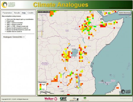
Let me give you an example. Here’s a screen grab (because that’s the only way I could think of to export a bit of the map) of the results, using all the defaults for simplicity, for the now-to-now comparison of the climate of my mother-in-law’s farm in the Limuru highlands (X=36.679110, Y=-1.077666).
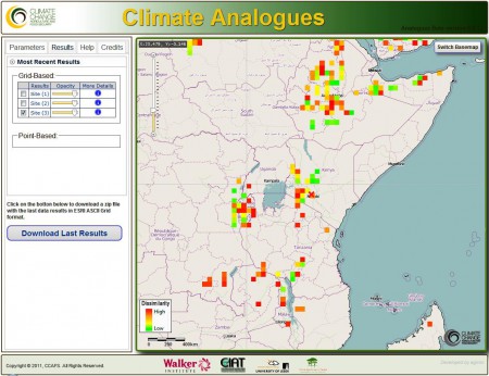
Let’s say we want to give my mother-in-law beans adapted to her current climate. Remember that what we’re looking for is high similarity, which means low dissimilarity, which means green, according to this legend (as I said, it’s a different legend in the “Results” tab). Phew. Anyway, we should look for the beans in Ethiopia, shouldn’t we. Result! Then we say to grandma, well you also need to look ahead, so here’s a map of places which right now look like your place will look like in 2030. You need beans from there too, madam.
Aha! Grandma needs beans from a bit further north in Kenya and the Great Lakes region as well as some bits of Ethiopia. 2 Yes, but wouldn’t it be nice at this stage to import a dataset of bean accessions worldwide and see if any of them come from green squares in either map? Can’t do it here, that I can see. Need to call the guy with the GIS, I suppose. Or wouldn’t it be nice to print out a nice map of Kenya that grandma can use to drive to the green squares and find bean farmers and swap some germplasm? Can’t do it here, that I can see. Need to call that GIS guy again, it seems. 3
So, in summary, a great idea, a significant technical achievement, and a potentially really useful tool for climate change adaptation. But it seems to me that if the greasemonkeys at CIAT really want this baby driven around at full speed by people other than other mechanics, they need to get back under the hood and do a thorough tune-up. Or tell me I’m wrong. I’d love to hear from you. Seriously. This is important.
- Well, ok, it doesn’t do the future-to-future comparison, but you get the picture.
- Interesting. Grandma will become more internationally interdependent for bean genetic resources. Must make sure to tell her that.
- Sidebar for the developers: When I ran the “forward” analysis, I got exactly the same map as with “backward”. No, really. I checked.


Can’t get the thing to work at all