Here’s a small taste of what you can do with the just-launched Food Systems Dashboard.
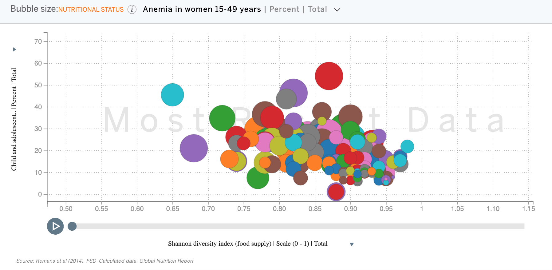
The graph shows the relationship between diversity of food supply (x-axis) and child/adolescent underweight (y-axis), with bubble size proportional to the incidence of anemia in women. The red outlier is India. Lots more variables to play with.
Is there a nicer way to share results than a screenshot though?