- It’s always good to be able nibble a paper with “wild asses” in the title. Especially since there’s nothing else on the internet today.
Nibbles: Yemen, Seed moisture, Irish fruits, Indian genetic erosion, Goji, Sustainable Ag, Green Revolution,
- Probably way more than you want to know about food security in Yemen, but stunning nonetheless.
- NordGen tells us how to measure seed moisture content. In Russian.
- The Irish have benefited from at least one bank. Alas, that bank is Pavlovsk.
- Indian farmers turning their back on traditional crops because of climate change. Hope NBPGR is on the case.
- Goji berries only as good as other fruit and veg, with “significant placebo effect”.
- [W]e are in the midst of shaping a new perspective on sustainable agriculture, it says here. Right.
- All you ever wanted to know about Green Revolution 2.0, thanks to Anastasia.
- Speaking of which .. sustainable ag under discussion.
Mapping rice agrobiodiversity from around the world
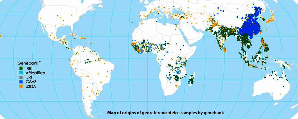
Ooooh, nice article from our friends at IRRI on mapping rice genebank accessions, something close to our hearts here at the Agricultural Biodiversity Weblog, as regular readers will testify.
I guess the main point made by the money map, reproduced below, is that while IRRI may be managing on behalf of us all (under Article 15 of the International Treaty on Plant Genetic Resources for Food and Agriculture, no less) the largest and most diverse collection of rice germplasm in the world, it doesn’t have everything.
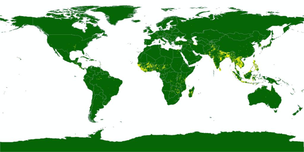
Problem is, not all of those other genebanks which nicely complement the IRRI collection make their material quite so obviously, freely and officially available to others. Plus, of course, we need the data from CIAT, EURISCO and all those other national genebanks. Genesys will help with that, hopefully, eventually. In the meantime, for comparison, this is what it now sees 1:
My eye was inevitably drawn to the outliers on that IRRI map. What is that northernmost collection, maybe in Kazakhstan? And alas the southernmost collection seems to have been cut off.
Anyway, now for the gap-filling!
Mashing up 3d trees and crop wild relatives
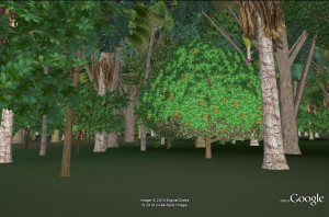 I’ve been exploring Google’s 3d trees thing a bit, to work out just how cool it is. I said in my previous post on this that it could eventually be used to document and virtually explore field genebanks (of coconuts, say, or breadfruit). But of course you can explore a few forests around the world right now, so I wondered if any crop wild relatives have been collected in any of these places.
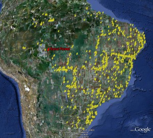 The answer is, alas, no, at least for Surui Forest in Brazil, one of the couple of “wild” places for which Google currently has 3d trees (the others are urban areas). At left you can see the distribution of accessions of crop wild relatives in Brazil, according to Genesys. Unfortunately, none fall within the area for which Google has 3d data.
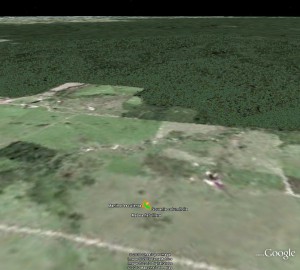 I did get a hit in GBIF for a cultivated cassava just outside the forest. But that’s not quite the same, I agree. Oh well, maybe we’ll soon have more data. 2
Earth Engine and crop wild relatives
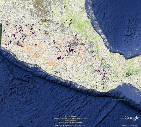
The other recent Google Earth innovation is Earth Engine, where you can check out a bunch of interesting visualizations of environmental data. Spurred by something Julian said, I downloaded the MODIS VCF global tree cover change dataset (2000-2005). And then I went to Genesys and downloaded data on wild beans (Phaseolus spp). It was not very difficult to put the two together in Google Earth. In the map below, which just looks at central Mexico, orange means high deforestation, and green afforestation. Is it me, or do germplasm accession seem to be concentrated in areas of high deforestation? Anyway, with a little work, this could be a cheap and cheerful way to identify particularly threatened areas for germplasm collecting.
Who wants to be the first to put crop wild relatives data in Earth Engine?
