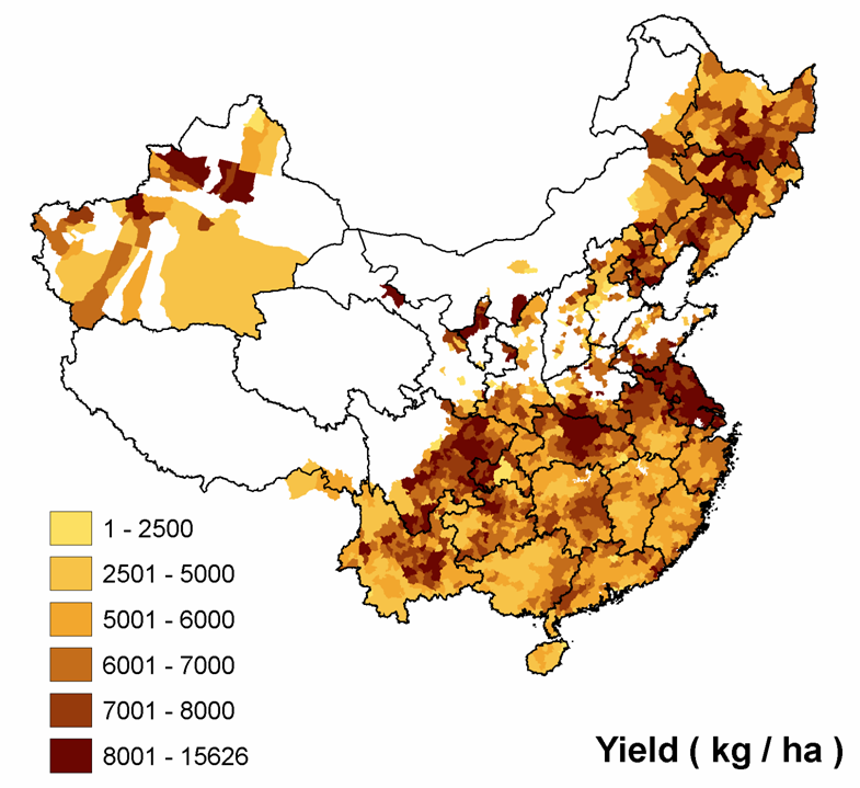
Remember Jeremy has an omnibus post about Chinese agrobiodiversity.
Agricultural Biodiversity Weblog
Agrobiodiversity is crops, livestock, foodways, microbes, pollinators, wild relatives …

Remember Jeremy has an omnibus post about Chinese agrobiodiversity.
A paper just out in Biological Conservation discusses crop wild relatives (CWR) in the UK. 2 The authors include some of the same British boffins who wrote a global survey of CWR conservation. The paper describes how to develop a comprehensive national plan for the conservation of CWR, using the UK as an example. Unfortunately, it is behind a paywall, but I’ll summarize the main points.
First, of course, you need to know what you’re dealing with. A UK national inventory of CWR was developed as part of the EU-funded PGR Forum project. It contains 15 families, 413 genera, 1955 species (44 endemic) — that’s 65% of the native flora. So then you have to prioritize. For example, 13 of the UK’s CWR species are considered threatened according to IUCN criteria and one is apparently extinct in the wild ( the grass Bromus interruptus). The authors ran an iterative algorithm on the distribution data for about 250 CWR species 3 to identify the smallest number of areas which would contain the largest number of species. Seventeen 10×10 km grid squares were selected within which could be found two thirds of the priority CWR species.
To what extent are these “hotspots” already protected? Interestingly, none of them “did not overlap with existing UK protected areas.” What’s now needed is to confirm the presence of the target species in the protected areas and come up with management plans specifically aimed at the CWR.
A 13-minute reportage on the Mapping for Change Conference which took place in Nairobi, Kenya on September 7-10, 2005. The reportage features interviews with participatory GIS and 3D mapping practitioners from around the globe and summarizes the process and outcomes of the event.Â
This has very little to do with agrobiodiversity, but I couldn’t resist mentioning it. I got an email from my friend Robert Hijmans at IRRI pointing me to this little-known fact:
West Bengal has many small exclaves within the Rajshahi division of Bangladesh, and vice versa. According to Brendan Whyte’s thesis, there are 106 of them. For the height of complexity, a part of Dahala Khagrabari, India is surrounded by Bangladeshi territory (part of Upanchowki Bhajni, Bangladesh), which is itself surrounded by Balapara Khagrabari, India, which in turn is surrounded by Bangladesh. This is the world’s only counter-counter-enclave.
Robert and his team are trying to map this in GADM, not without a little difficulty. GADM is part of the BioGeoMancer project, about which I blogged way back.
GADM is a database of the location of the world’s administrative areas (boundaries). Administrative areas in this database are countries and lower level subdivisions such as provinces, departments, bibhag, bundeslander, daerah istimewa, fivondronana, krong, landsvæðun, opština, sous-préfectures, counties, and thana. GADM describes where these administrative areas are (the “spatial features”), and for each area it provides some attributes, foremost being the name and variant names.
Having been involved in the botanical exploration of the Indian Ocean island of Socotra back in the early 90s, and also — more recently — having done some ecological niche modeling, I was fascinated to see these interests coincide in a recent paper in Biological Conservation. Italian and Yemeni researchers 4 have modeled the distribution of the Socotran endemic Dracaena cinnabari, the Dragonblood Tree, to predict what might happen to it with climate change. It’s not good. This flagship species, whose resin has been the source of a dye and medicine since antiquity, is looking at a halving of its potential area of distribution, due to drier conditions, and only a couple of its current localities will fall within what will remain suitable. Fortunately, they are near a protected area, and the authors recommend that its boundaries be expanded to include them.