A letter in Nature this week looks at “Global trends in emerging infectious diseases.” 1 It includes some interesting maps, including these:
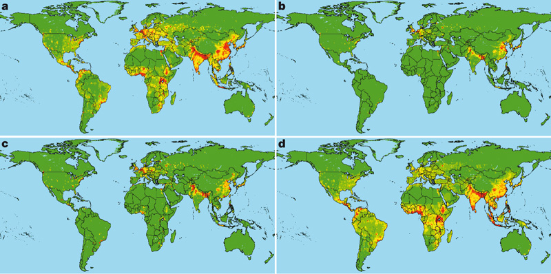
They show the global distribution of relative risk of an emerging infectious disease (EID) event caused by: (a) zoonotic pathogens from wildlife, (b) zoonotic pathogens from non-wildlife, (c) drug-resistant pathogens and (d) vector-borne pathogens. That’s based on climate, human population density and growth, and wildlife host species richness. Note in particular the map in the top right-hand corner: basically risk of zoonotic pathogens jumping to humans from livestock. Compare this livestock density 2:
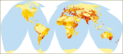
Not a great match with density of domesticated animals. Maybe the correlation would be better with livestock diversity?
- Kate E. Jones, Nikkita G. Patel, Marc A. Levy, Adam Storeygard, Deborah Balk, John L. Gittleman & Peter Daszak. Nature 451, 990-993 (21 February 2008); doi:10.1038/nature06536.
- FAO has more data on this.
One Reply to “Disease hotspots mapped”