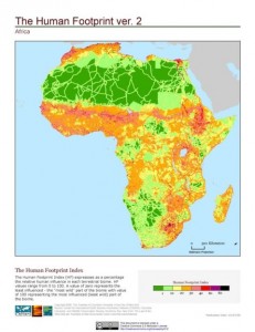
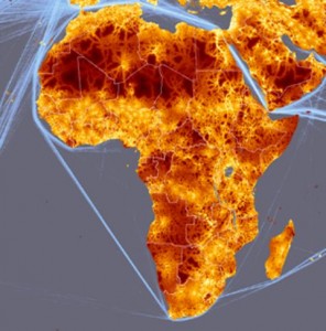
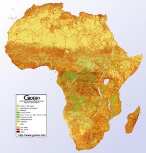
I ran the Last of the Wild dataset I talked about yesterday past our friend Andy Nelson, he of the accessibility map, and his reaction was that there was a quick paper, or at least an MSc thesis, in comparing that map with his and with the product of the GLOBIO project. Well, here’s what Africa looks like according to the three different methodologies, just to give you a taste. Quite similar, at first look, though we’ll have to wait for that MSc to be sure, I guess. Now, the question is, can such data be used to predict things like the amount of agrobiodiversity in farmers’ fields?


