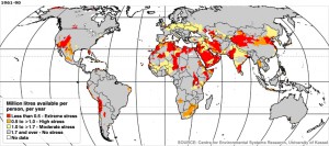
The BBC had an interesting series of maps in December last year on the effects of climate change, economic and population growth on per-capita water availability, based on the work of Martina Floerke and colleagues at the University of Kassel in Germany. Here’s the picture for 1961-90. Red is bad.
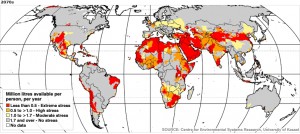
And here is the 2070s. Click to enlarge.
Doesn’t look good, particularly for Central and West Asia, and both southern and North Africa. That’s where your drought tolerant crop varieties are going to come in useful, I guess. And not just that. But I don’t understand how Australia gets away with it so lightly.


Australia might get more red areas if it was per head of cattle or per head of sheep rather than per person – except for Adelaide which depends heavily on the Murray-Darling, most of the Ozzie population is in the relatively narrow range of places where it tends to rain some even when most of the country is in drought.
And bear in mind – those two small orange blotches in the Southeast are Melbourne and Sydney, which is 40% of Australia’s population. There’s also a small orange blotch further up the coast which is Brisbane, and a broad yellow swathe in the inhabited part of WA.
So it might not look like much on the map, but its more than half the Australian population predicted to be faced with high or moderate water stress.