Where does crop X grow? Important question. And pretty simple too, no? No! Because just a little looking around yields about half a dozen different answers, and no clear idea of which to trust, or how they relate to each other, or how they were arrived at, or even if there are more.
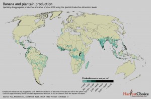
Here’s what I came up with in only about half an hour of searching. The following are all data for banana/plantains. First, there’s MapSpaM (that would be Spatial Production Allocation Model), from HarvestChoice:
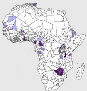
Then there’s FAO’s AgroMAPS, which has some really weird data in it. Try looking at the distribution of cassava in Africa, for example. Anyway, here’s banana, which actually looks pretty weird itself:
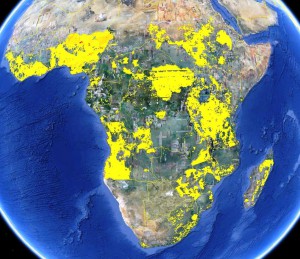
And then there’s CIAT’s Crop Atlas of the World. 1 That says it is based on the FAO data, but doesn’t really seem like it to me, at least not on this evidence:
In its time, CIAT has also used the dataset from the Land Use and Global Environmental Change project called “Harvested Area and Yields of 175 crops (M3-Crops Data),” but I haven’t been able to get a map of that.
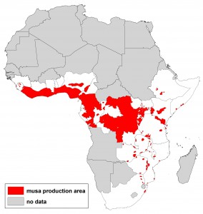
And then there’s IITA’s banana mapping effort, which admittedly is very much still a work in progress:
Well, I suppose I could sort out some of the questions I have about all this if I spent a little more time at it. But really, should a poor boy have to? Shouldn’t FAO, or the CGIAR, have all this sorted out by now? Anyone out there want to guide me through this?
- Which as you can see if you click on that link does not exist as a separate thing any more, but the components of which you can find on the Harvest Choice data catalogue.


This is what you’d normally expect when there’s no coordination or data sharing among institutions: you end up with several institutions, each one re-inventing the wheel. The public then does not know which source to use. None of them report uncertainties or assess the quality of their input data.
Some clarifications:
1. MapSPAM from Harvest Choice is based upon FAOSTAT and AgroMAPS. The methods are described here.
2. CIAT’s dataset is simply a KML version of MapSPAM (but based on an earlier version of the maps [they’ve been updating them constantly since the first release]).
3. The 175 crop datasets are available here [third paragraph]. These are also based on country and sub-country level statistics (I’d guess raw data are from FAO, since the maps pretty much resemble MapSPAM). Monfreda et al (2008) methods can be found here. I drew banana and plantain global maps. Pixel values indicate the fraction of area in each cell occupied by each particular crop.
4. IITA’s work is quite a different approach and uses expert-based cropping zone identification.
5. Visibly, several data gaps still exist in AgroMAPS, and one would hope these could be filled by regional agricultural departments or research centers.
So, you end up with two sources of data: (1) FAO country level statistics, and (2) expert knowledge; two methods: Monfreda et al.’s and HarvestChoice’s; and one visualization tool. Anyone interested in comparing or merging?
The point data from genetic resource collections and GBIF should be useful to fill some gaps or for cross-referencing, although these also include historical, no longer existing source locations.
Thanks for an interesting article. I get the feeling that the maps are actually maps showing availablility of data rather than availability of bananas. A quick seach for on the www for “laos bananas” soon reveals that bananas grow abundantly there but some of these maps seem to indicate that bananas suddenly stop growing at the polictical borders of this country. To answer the question, Where do bananas grow anyway? I think I’ll use a country by country search of the www – fewer quantitative data, but more solid information!
We’ve just finished working on vulnerability of climate change to staple crops in East Africa, of course we worked on banana. Results will be available soon. I would be willing to compare and merge this datasets.