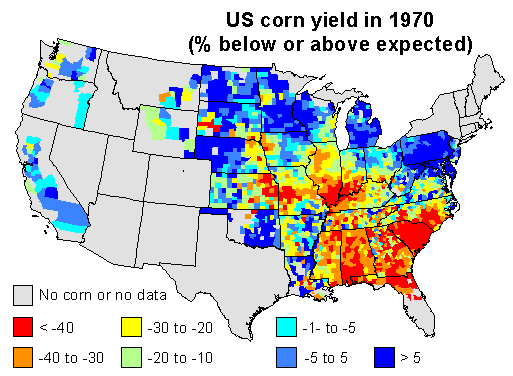
Here are my 2 maps 1 for this discussion. I used linear regression to predict corn yield for each county in the US, using time (year) as the independent variable. I used the years 1950 to 1969 to create the model, and to predict corn yield in 1970. This should be a reasonable estimate of the ‘expected yield’ for 1970 for each county, if it had been a ‘normal year’.
I then computed the difference between the expected yield and the yield obtained by farmers, and expressed that as the percentage of the expected yield. Negative numbers mean that yields were lower than expected in a county, positive numbers mean that they were higher than expected. Counties with data for less than 9 years were excluded.
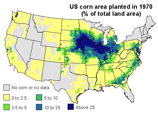
1970 corn yields were indeed much lower than expected in the southeast. Corn blight hit very hard. But also note that yield was stable or up in the north and in the west, and look were US corn was grown in 1970. The map below expresses corn area as the percentage of the total area of a county.
Most corn is grown in the corn-belt. The southern parts of it were much affected by the disease (The Illinois Secretary of Agriculture’s estimate that, by August, 25 percent of his state’s corn crop had been lost to the blight may have been spot on). But 1970 was a normal or good year for corn yield in the northern and western parts of the corn belt, and that compensated for the losses incurred elsewhere. If you sum it all up, corn production was about 15% lower than what could have been expected. That is whole lot of corn — but perhaps not that exceptional as far as bad years go.
Here is a table of estimated corn yield by state, as percentage of the expected yield for 1970, and the corn area, as percentage of the national area (only for states with more than 1% of the national corn area in the counties data set).
| State | Yield | Area | State | Yield | Area | |
|---|---|---|---|---|---|---|
| Florida | -36 | 1 | Minnesota | -12 | 8 | |
| Georgia | -33 | 3 | Missouri | -11 | 5 | |
| Illinois | -31 | 18 | Nebraska | -9 | 9 | |
| Indiana | -27 | 9 | North Carolina | -5 | 2 | |
| Iowa | -26 | 18 | Ohio | -1 | 5 | |
| Kansas | -24 | 2 | Pennsylvania | 0 | 2 | |
| Kentucky | -22 | 2 | South Dakota | 6 | 4 | |
| Michigan | -12 | 3 | Wisconsin | 15 | 3 |


Thanks Robert. Very impressive. Funny that, given Jacob’s numbers for Florida, your map does not have yield deviations for Florida.
There wasn’t much county level data for Florida; but the data available suggest a very large yield reduction, in the order of 40-50%, like in neighboring Georgia (as you can see, most of the Florida corn was grown near the Georgian border and vice versa). I’ll work on improving these maps, this is important enough to get it right.
Later: I have updated the map and table, and added Florida to the table (I would normally have excluded it for not having much corn area). Next on the to-do list is to check how much of the yield drop might be explained by the weather in 1970.