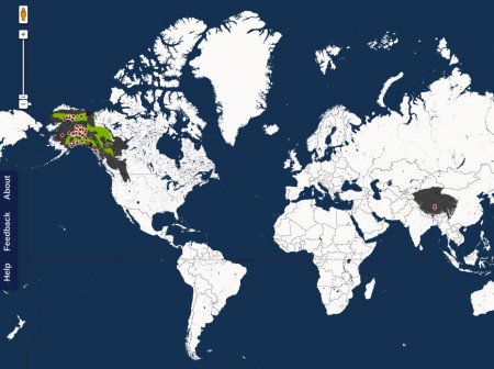
Yes, indeed Map of Life is indeed live, as we Nibbled yesterday, at least for amphibians, birds, reptiles, mammals and fish. 1 MoL pulls in point data from GBIF, of course, but also polygon distribution maps from IUCN, user-uploaded maps, local inventories from various sources and the regional checklists from WWF. That’s a whole load of different sources, formats and types of data to be served up in one googly visualization. Quite impressive. Which does make one wonder why one is reduced to screengrabs to share the results, as for example below for the yak and Dall’s Sheep, two of the high altitude mammals we featured a few days back. No doubt they’ll sort that out.
And we of course also look forward to the inclusion of plants, and in particular crop wild relatives, in the near future. We can point them to some data sources for those…

One Reply to “Mapping some life”