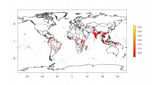
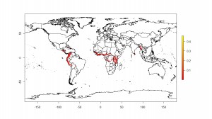
 More today on where bananas grow. Or where people think they may grow, anyway. First, let’s tie up some loose ends. Yesterday I mentioned Chad Monfreda‘s dataset from the Land Use and Global Environmental Change project, but said that I hadn’t been able to get an actual map. Thanks to Julian and Andy, I now have. To the left is the result for banana.
And to the right for plantain. 
Andy also pointed me to another dataset, called MIRCA2000: “Global data set of monthly irrigated and rainfed crop areas around the year 2000.” Here’s Andy’s pragmatic take on this proliferation of datasets:
You do have information on quality and uncertainties and there is enough info — if you are interested — to work out which to use. I don’t believe that there is a right or wrong answer here, they all try to make the best of what is often very cruddy and incomplete data.
In short – you’ll have to sort it out yourself, along with the rest of us. I just take the average of these when I need to make a rice area map – though the average of a bunch of wrong datasets is still a wrong dataset.
It’s a choice between modelled crop distributions or statistical data or a combination of both. Neither is wholly accurate and like most global data sets, it is best not to look too closely at the results.
4 data sets are better than none right?
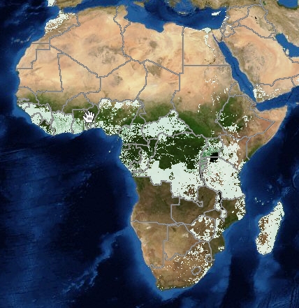
Glenn also chimed in with his work for the Generation Challenge Programme, which uses the SPAM dataset I mentioned yesterday. It’s still in beta, so you can’t play around with it yet, but, again, this is what banana in Africa looks like:
Julian sums it up very well in his very comprehensive comment on yesterday’s post, and I leave the final word to him:
This is what you’d normally expect when there’s no coordination or data sharing among institutions: you end up with several institutions, each one re-inventing the wheel. The public then does not know which source to use.
…
So, you end up with two sources of data: (1) FAO country level statistics, and (2) expert knowledge; two methods: Monfreda et al.’s and HarvestChoice’s; and one visualization tool. Anyone interested in comparing or merging?

You put your personal google docs account link for the Micra2000 “Global data set of monthly irrigated and rainfed crop areas around the year 2000” data which I would have liked to see…
Sorry. Fixed.